luke strawwalker
I really should change my personal text
- Joined
- 28 November 2012
- Messages
- 41
- Reaction score
- 7
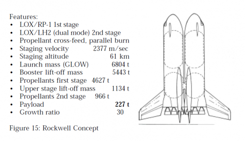
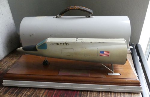
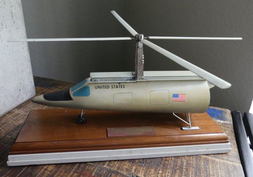
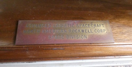
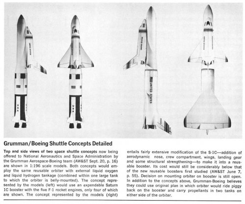
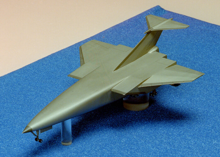
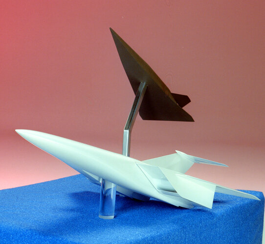
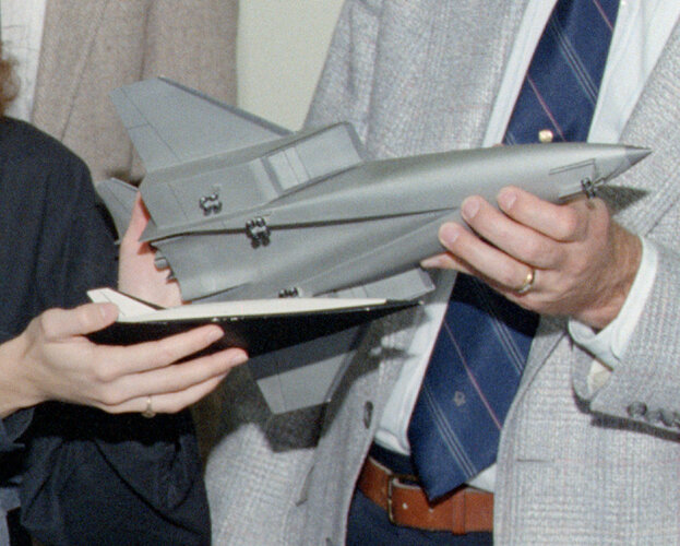
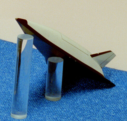
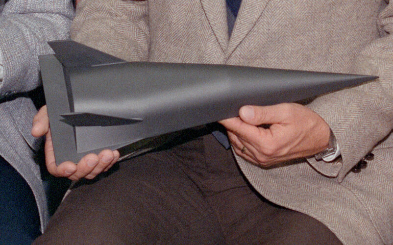
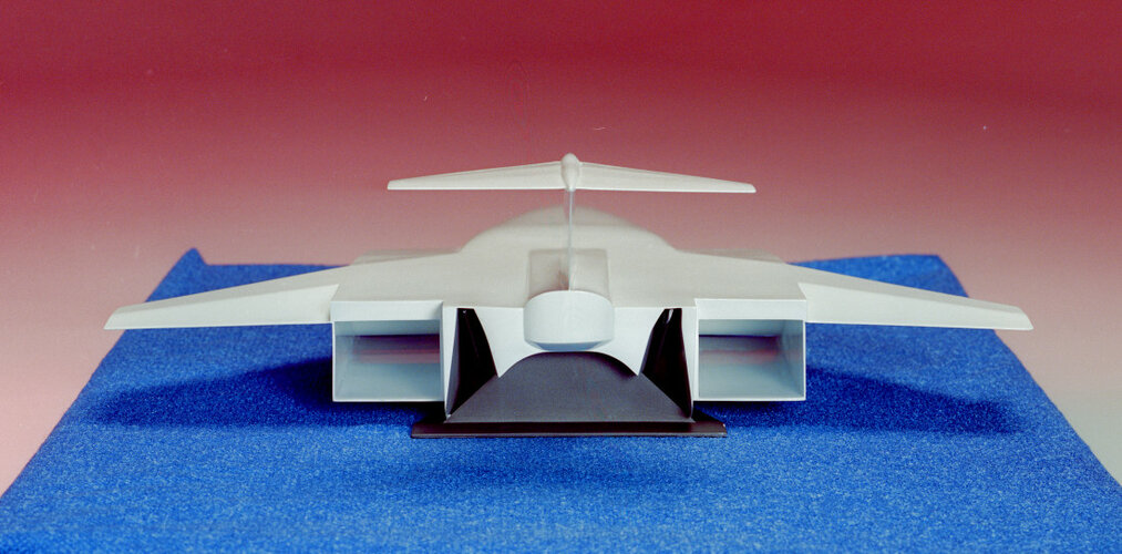
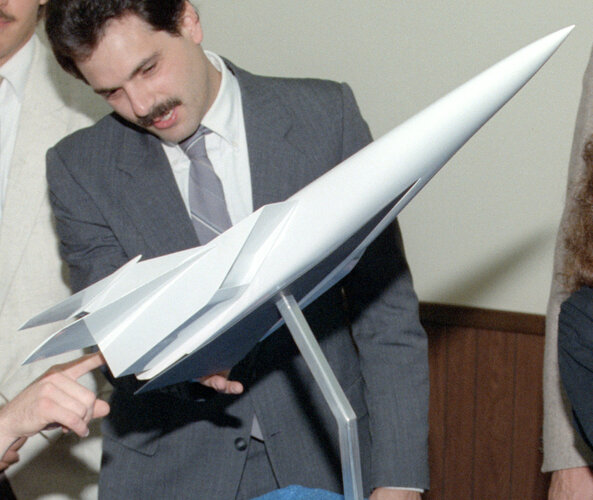
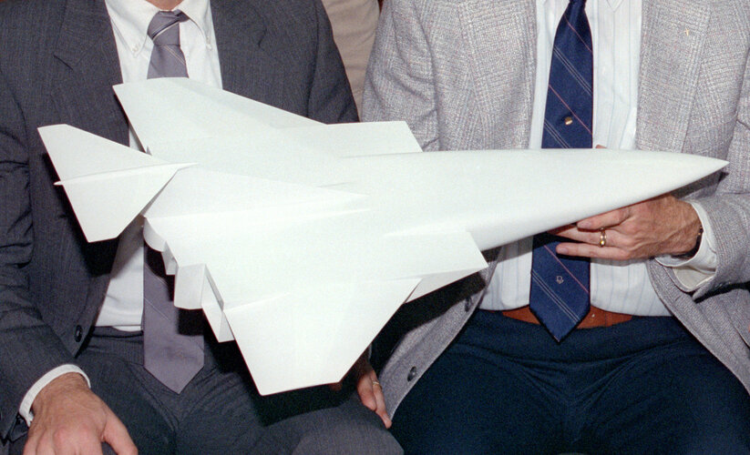
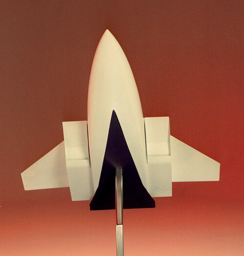
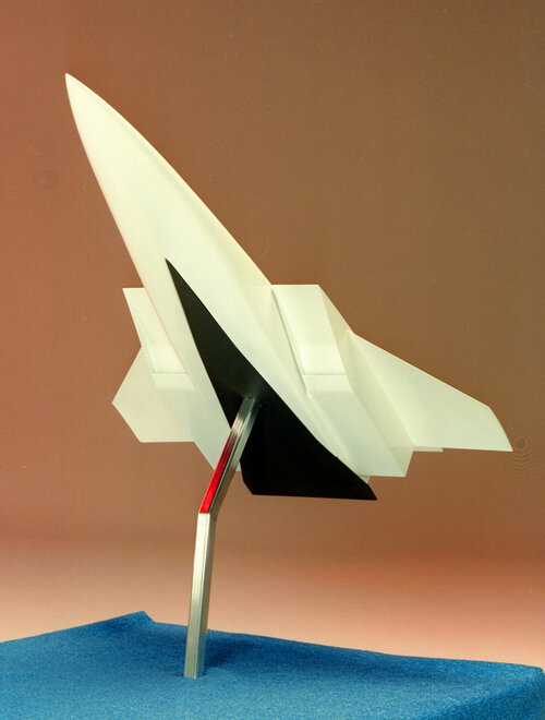
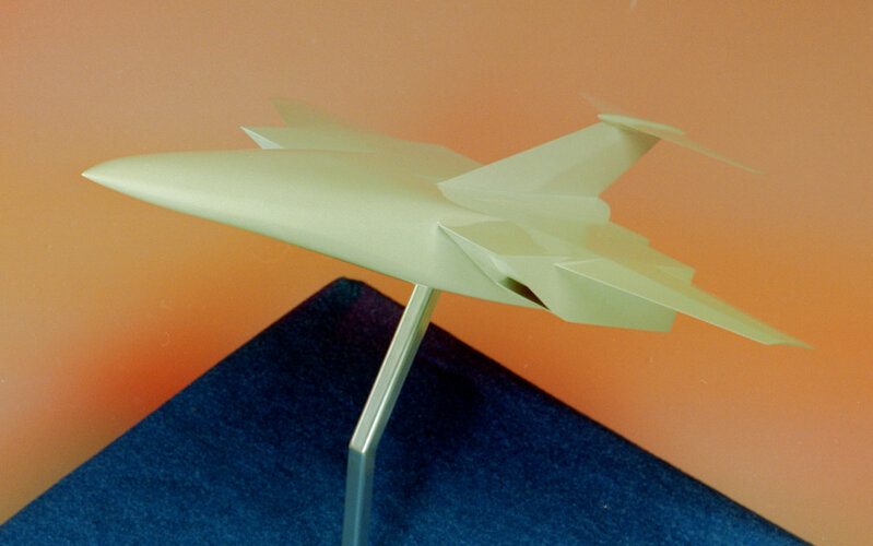
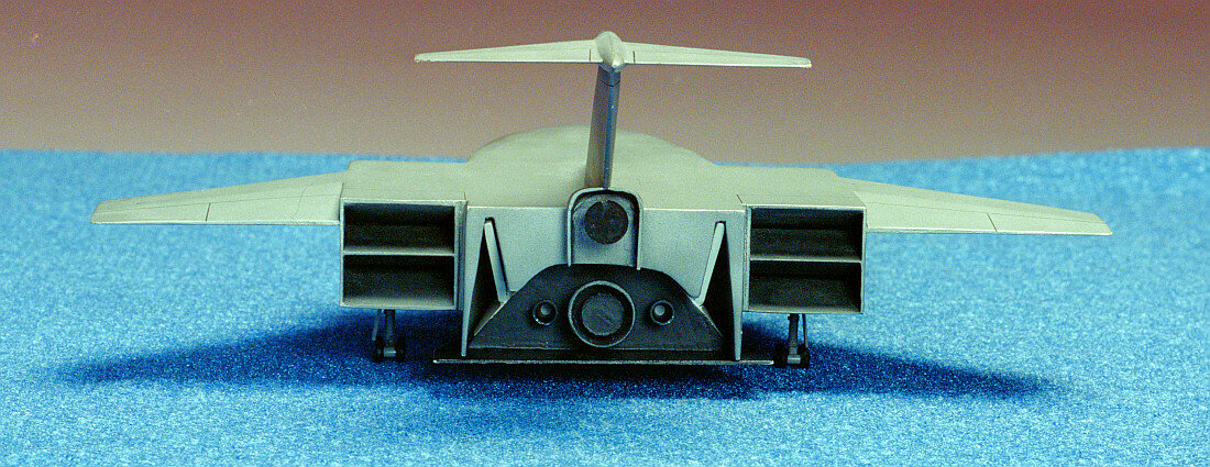
carmelo said:circle-5 said:Elegant space shuttle orbiter model -- can't remember which contractor proposed this design, or if it was strictly a NASA study...
Strange!
The orbiter have the "Nasa worm" on the wing.
Is not from early 70s.
But when the "worm" was approved the definitive Shuttle design was not already chosen?
Maybe the worm logo itself was a proposal at that point, something that the contractor incorporated into their model to make it look "futuristic"... or something the contractor conjured up that NASA later adopted themselves as "futuristic"...
Anybody have definitive history on the worm logo and how it was proposed and adopted?? Stranger things have happened...
Later! OL JR
")