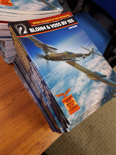
Secret Projects of the Luftwaffe: Blohm & Voss BV 155 by Dan Sharp

newsdeskdan

ACCESS: Top Secret
Top Contributor
Senior Member
Joined
11 June 2014
Messages
1,319
Reaction score
1,677
SPL -  Blohm & Voss BV 155 (1).jpg

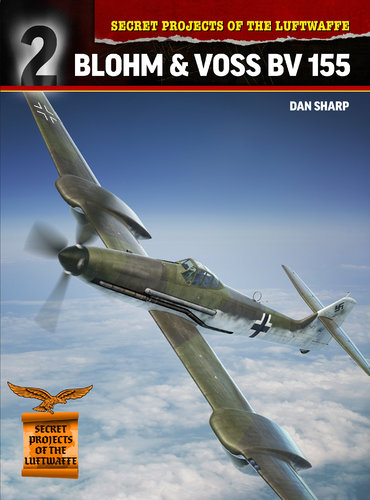
Secret Projects of the Luftwaffe: Blohm & Voss BV 155
by Dan Sharp

Cover art: Gino Marcomini
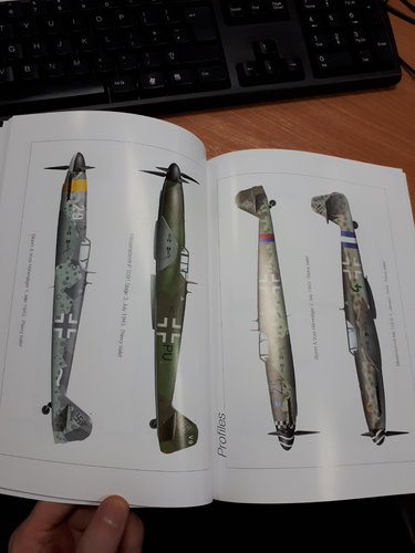
Profile artworks: Thierry Vallet
Pages: 116
Price: £12.99 / $19.99
Format: Softback 248 x 184mm
Availability: December 2019
Pre-order: https://www.mortonsbooks.co.uk/product/view/productCode/15026

The story of the Messerschmitt Bf 109’s most radical development, the Blohm & Voss BV 155, began in early 1942 as German planners considered the likelihood of America operating high-altitude bombers over occupied Europe. It was decided that a re-engined Bf 109 with extended wings, a wide-track undercarriage and a pressure cabin could meet this threat and the type was designated Me 155. A complex and challenging period of development followed, with Messerschmitt’s high-altitude fighter going through numerous iterations before manpower shortages and the urgent need to prepare the Me 262 for series production compelled the company to seek outside help.
Hamburg-based Blohm & Voss stepped in and the project became the BV 155. Despite a steep technological learning curve, official indifference and a fraught relationship with Messerschmitt, Blohm & Voss succeeded in building and flying a prototype just over a year after taking on the project. Using original wartime documents, author Dan Sharp explains and explores the history of this fascinating and unusual branch of the Bf 109 fighter family.

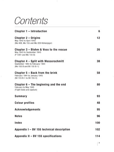
BV 155 contents.jpg
 
Last edited:
I thought this deserved its own thread. It's composed entirely of new content that hasn't appeared in any of my bookazines. Incidentally, two new photographs of the only surviving BV 155 airframe at NASM are included, specially taken for this book. Apparently the airframe is in deep storage and very difficult to access ordinarily.
 
Last edited:
Now back from the printers - only the second book ever written about the weirdest Bf 109 derivative. Also, possibly the first book on any German 'secret project' to be fully annotated with every source reference listed (about 140 separate period documents).
 

Attachments

  • 20191202_113837.jpg
    20191202_113837.jpg
    1.9 MB · Views: 129
  • 20191202_123826.jpg
    20191202_123826.jpg
    1.8 MB · Views: 188
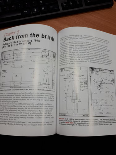
I must admit to not having a designer's eye for such things. My primary focus remains historical accuracy and the use of contemporary illustrations taken directly from period documents. I believe this to be the most accurate account of the Blohm & Voss BV 155's history ever written.
 
Looks interesting to me ... and having the first book (Monogram Close-Up) it will be intersting to compare.

JCC

Thanks JC. Looking through Thomas H. Hitchcock's Monogram Close-Up book on the BV 155 of 1990, it's clear which sources he used, though he doesn't credit them. There are some large gaps in his narrative that I've been able to fill and a few inaccuracies in what he does have that I've been able to correct. Those aspects of his work which stick strictly to the original documents are of course accurate. On the whole though he did a good job with what he had.
The main point on which his work diverges from mine is on the break with Messerschmitt. Hitchcock is very sympathetic to Blohm & Voss (presumably because he'd corresponded with Vogt while the latter was still alive) particularly in describing the mix-up over the meeting on November 11-12, 1943.
Hitchcock relates how the B&V men weren't told about a change of venue, how Professor Messerschmitt himself failed to turn up, how "Herr Pohlmann and his team were surprised that a meal was not provided for them, but instead, they were asked to dine in the general mess hall, which was highly improvised" etc. All of which led to Pohlmann and his team feeling "angry, disappointed and let down by their experience. They felt they had been repeatedly lied to, misled by improvisation and not shown common courtesy".
Looking at this objectively, though, it's evident that Messerschmitt had been bending over backwards to help B&V up to this point, and that B&V had been used to building a handful seaplanes every month whereas Messerschmitt was a vast operation involving a huge supply chain for numerous different types both in service and in development. The B&V men were from a different world, where everything could be done on time and everyone was free to attend any meeting that was called.
Vogt actually rang the RLM to complain (which Hitchcock doesn't mention) and the RLM sent a couple of strongly-worded telegrams to Messerschmitt ordering it to 'stop interfering' with Blohm & Voss. This came as a real shock to Messerschmitt, which then immediately put a stop to all the design and development support it had been providing up to that point. Vogt pushed for sole custody of the project and got it but it was interesting to finally hear the other side of the story from Messerschmitt's documents concerning the exchange.
Then of course there's the issue of who actually crashed the BV 155 V1. I can tell you for certain that it wasn't the careless (and anonymous) British pilot that Hitchcock blames.
 
Last edited:
A bit late for that.
Most unfortunate! Especially as the book format Spitfires over Berlin is fully-justified. Plus medium format books should be done with 2 columns, not 1.

For me, I don't care about the layout but rather the information contained. Looking very much to see/read this one, especially if it is as good as your other publications Dan.
 
I'll tell you after reading it. I will have to check La Maison du Livre as it seems to be the local point were your books are available.
But I greatly appreciate your work on your main Luftwaffe projects line, especially all the background info about meetings going sour etc... Your account on how Lippisch, Horten and Messerchmitt competited on the flying wing idea and how Focke-Wulf denigrated the idea was fascinating.

JCC
 
A bit late for that.
Most unfortunate! Especially as the book format Spitfires over Berlin is fully-justified. Plus medium format books should be done with 2 columns, not 1.

For me, I don't care about the layout but rather the information contained. Looking very much to see/read this one, especially if it is as good as your other publications Dan.

Content is king for sure, but a little part of me dies inside when great content is presented in a less than beautiful format. There is a beauty of symmetry in a good page layout.

A multi-column layout is primarily about readability not beauty. Long lines are not ideal for reading. However, the book above seems have quite short lines for a single column layout, so either the pages are small or the type quite big, or both, and its not necessarily the the case that it ought to be 2 column for readability.

Justification is harder to argue technically, as most readability research shows that justified text is slightly harder to read, particularly when done badly (Word, I'm looking at you). Its traditional for books to be justified, and it was once only achievable by typesetting professionals, and therefore justified text gives older readers in particular a feeling of being professionally published, as opposed to a "fanzine" or self-published book.
 
Last edited:
A bit late for that.
Most unfortunate! Especially as the book format Spitfires over Berlin is fully-justified. Plus medium format books should be done with 2 columns, not 1.

For me, I don't care about the layout but rather the information contained. Looking very much to see/read this one, especially if it is as good as your other publications Dan.

Content is king for sure, but a little part of me dies inside when great content is presented in a less than beautiful format. There is a beauty of symmetry in a good page layout.

A multi-column layout is primarily about readability not beauty. Long lines are not ideal for reading. However, the book above seems have quite short lines for a single column layout, so either the pages are small or the type quite big, or both, and its not necessarily the the case that it ought to be 2 column for readability.

Justification is harder to argue technically, as most readability research shows that justified text is slightly harder to read, particularly when done badly (Word, I'm looking at you). Its traditional for books to be justified, and it was once only achievable by typesetting professionals, and therefore justified text gives older readers in particular a feeling of being professionally published, as opposed to a "fanzine" or self-published book.

I must be an oddity in never having bought a book because I appreciated the layout of its pages. Neither have I ever been dissuaded from buying a book because I disliked the layout of its pages.
I have never in my life passed judgement on a book I haven't read, no matter how its pages were laid out - but I am sometimes prepared to say harsh things about books I have read and found to be inaccurate, misleading, poorly researched, dull, badly written or badly edited. The page layout of such a book does not interest me in the slightest. I'm not too fond of speculative material either.
I am ready to spend a lot of money if a book appears to have original secret project drawings in it I've never seen before, or promises to shed new light on a subject I care about. Books which offer accurate technical details hitherto unknown about secret project aircraft designs, particularly British cold war or German WW2, have my full attention.
When I buy a book, the first thing I do is look at the pictures. I shouldn't but I do. Are there any new discoveries to be seen? Then I read the text. How does the author tackle the subject? What is the book saying? What are the key points, the arguments, the lines of enquiry? Is the author telling a straight history or do they have an agenda I can discern by reading between the lines? I mull over their conclusions and think about the points that struck me as incongruous or inspired.
When I have absorbed everything else, I look carefully at the footnotes (if there are any) to see whether there are any sources in there I haven't already investigated myself. Then, if the book struck me as solidly researched and reliable, or as having some other point of merit (despite not being solidly researched and reliable), I put it on my shelf. Otherwise, it goes in one of the 50 litre boxes in the garage - an unfortunate waste of money and a problem for another day.
I know that some people dislike pages designed a certain way, but the way a page is laid out tells me nothing about the secret projects described on it.
 
Last edited:
The only series of books where I thoroughly disliked the text layout were the large-format books that Putnam did late in their life. I hated the three-column layout. I much preferred their classic books.
 
Poor layout wouldn’t stop me buying a book if the content is good, but the cost of specialist books is usually high and I feel that great content deserves to be presented in the best way possible. What angers me is easily avoidable mistakes. For example Jared Zichek’s book which has multiple pages of almost illegible drawings which would have taken mere minutes to correct in a photo editing application.

Often the author is at the mercy of the publisher, and publishers no longer have skilled designers in house. So it’s a bit of a lottery. I did my own layout for my P1121 book due to unavailability of the normal person which is why my book looks a little different from other project tech books. Text is justified for example.
 
These days I aim to simply write the most factually accurate histories I can, based on period source material, but back when I started out writing bookazines like Sex, Spies and Nuclear Missiles I used to come up with a visual concept for each chapter - colours and themes which complemented the text. I also used to agonize over the text in a way I wouldn't today - probably because I was forced to rely on existing secondary and tertiary sources for reference. I would obliquely refute some sources, challenge existing arguments and try to offer my own interpretation of the 'facts' (I had little idea of how to go about checking those facts using primary sources at this stage). I thought I was terribly clever, building Easter eggs into the text which I knew most people wouldn't notice and constructing sentences in a very particular way for my own amusement. No one ever actually noticed any of this.
I honestly can't recall anything about the number of columns used or whether the text was justified or not.
 
A bit late for that.
Most unfortunate! Especially as the book format Spitfires over Berlin is fully-justified. Plus medium format books should be done with 2 columns, not 1.

For me, I don't care about the layout but rather the information contained. Looking very much to see/read this one, especially if it is as good as your other publications Dan.

Content is king for sure, but a little part of me dies inside when great content is presented in a less than beautiful format. There is a beauty of symmetry in a good page layout.

A multi-column layout is primarily about readability not beauty. Long lines are not ideal for reading. However, the book above seems have quite short lines for a single column layout, so either the pages are small or the type quite big, or both, and its not necessarily the the case that it ought to be 2 column for readability.

Justification is harder to argue technically, as most readability research shows that justified text is slightly harder to read, particularly when done badly (Word, I'm looking at you). Its traditional for books to be justified, and it was once only achievable by typesetting professionals, and therefore justified text gives older readers in particular a feeling of being professionally published, as opposed to a "fanzine" or self-published book.

I must be an oddity in never having bought a book because I appreciated the layout of its pages. Neither have I ever been dissuaded from buying a book because I disliked the layout of its pages.
I have never in my life passed judgement on a book I haven't read, no matter how its pages were laid out - but I am sometimes prepared to say harsh things about books I have read and found to be inaccurate, misleading, poorly researched, dull, badly written or badly edited. The page layout of such a book does not interest me in the slightest. I'm not too fond of speculative material either.
I am ready to spend a lot of money if a book appears to have original secret project drawings in it I've never seen before, or promises to shed new light on a subject I care about. Books which offer accurate technical details hitherto unknown about secret project aircraft designs, particularly British cold war or German WW2, have my full attention.
When I buy a book, the first thing I do is look at the pictures. I shouldn't but I do. Are there any new discoveries to be seen? Then I read the text. How does the author tackle the subject? What is the book saying? What are the key points, the arguments, the lines of enquiry? Is the author telling a straight history or do they have an agenda I can discern by reading between the lines? I mull over their conclusions and think about the points that struck me as incongruous or inspired.
When I have absorbed everything else, I look carefully at the footnotes (if there are any) to see whether there are any sources in there I haven't already investigated myself. Then, if the book struck me as solidly researched and reliable, or as having some other point of merit (despite not being solidly researched and reliable), I put it on my shelf. Otherwise, it goes in one of the 50 litre boxes in the garage - an unfortunate waste of money and a problem for another day.
I know that some people dislike pages designed a certain way, but the way a page is laid out tells me nothing about the secret projects described on it.

I have been in the book business a long time. In this particular case, information comes first, followed by readability. Of the handful of original CIOS and BIOS reports I have, I could care less about layout. The content meant that what I paid for them left my mind shortly after I started reading. Since I have knowledge of typesetting and keylining by hand, I understand the two column, justified text approach, among other things. And I respect this standard. However, in some specific cases, I can understand the approach used by this book publisher. If I was in charge, it would be two columns but I am not.

Thank you Dan. And as soon as I see the words "unpublished photos" or "unpublished drawings," I need only see that the author is a professional and that book goes to the top of a very long list. I will close by saying I recently bought a book about something I really wanted good information on, but the author overlaid his own words among factual history. It was highly unnecessary.
 
These days I aim to simply write the most factually accurate histories I can, based on period source material, but back when I started out writing bookazines like Sex, Spies and Nuclear Missiles I used to come up with a visual concept for each chapter - colours and themes which complemented the text. I also used to agonize over the text in a way I wouldn't today - probably because I was forced to rely on existing secondary and tertiary sources for reference. I would obliquely refute some sources, challenge existing arguments and try to offer my own interpretation of the 'facts' (I had little idea of how to go about checking those facts using primary sources at this stage). I thought I was terribly clever, building Easter eggs into the text which I knew most people wouldn't notice and constructing sentences in a very particular way for my own amusement. No one ever actually noticed any of this.
I honestly can't recall anything about the number of columns used or whether the text was justified or not.

I am a text person, love reading, good at spotting typos. My graphics abilities are strictly secondary. My friend is a former typesetter and graphic designer.

One day was outraged by the most atrocious spelling in an magazine. "Jesus, look at that!" I said, pointing to the offending text. "That's awful, the font is horizontally scaled far too wide, really disgusting" replied my friend.
 
My copy arrived from Morton's today. First glance looks great; I expect a lot of interesting reading here.
 
My copy arrived from Morton's today. First glance looks great; I expect a lot of interesting reading here.
I'm roughly halfway through it now and I have to complement Dan on a good blending of information, readability, and annotation. The history of the program is quite interesting and has a certain feel of "deja vu" for anyone who has worked in the aerospace industry. Further comments after I complete the book, but I will say that, if the rest of the series are up to this standard, it looks to be an excellent series.

12-27 Edit: I've finished it and I find it an excellent and readable history of this aircraft. I will admit that reading this gives me a much better appreciation of Republic and Lockheed being able to successfully develop and produce fighters using turbo-supercharged engines.
 
Last edited:
View attachment 622017

Secret Projects of the Luftwaffe: Blohm & Voss BV 155
by Dan Sharp

Cover art: Gino Marcomini
Profile artworks: Thierry Vallet
Pages: 116
Price: £12.99 / $19.99
Format: Softback 248 x 184mm
Availability: December 2019
Pre-order: https://www.mortonsbooks.co.uk/product/view/productCode/15026

The story of the Messerschmitt Bf 109’s most radical development, the Blohm & Voss BV 155, began in early 1942 as German planners considered the likelihood of America operating high-altitude bombers over occupied Europe. It was decided that a re-engined Bf 109 with extended wings, a wide-track undercarriage and a pressure cabin could meet this threat and the type was designated Me 155. A complex and challenging period of development followed, with Messerschmitt’s high-altitude fighter going through numerous iterations before manpower shortages and the urgent need to prepare the Me 262 for series production compelled the company to seek outside help.
Hamburg-based Blohm & Voss stepped in and the project became the BV 155. Despite a steep technological learning curve, official indifference and a fraught relationship with Messerschmitt, Blohm & Voss succeeded in building and flying a prototype just over a year after taking on the project. Using original wartime documents, author Dan Sharp explains and explores the history of this fascinating and unusual branch of the Bf 109 fighter family.

View attachment 622019
Hello. Is it possible to buy this book in electronic form?

At present no, I'm afraid not.
 
Received my copy today. Looks very good (except the ragged-right)! I do have to question Sharp's decision to use dumbed-down punctuation. It reduced the text's authority.

It definitely did. In fact one might peevishly propose, were one inclined to be appropriately verbose, that the published prose heretofore exposed must pose certain questions concerning the grammatical style imposed; which is to say, should there be rude doubt in any way, that one's capacity to utilise one's mother tongue over many years, in print, for the edification of one's peers (and others too, I fear) has undeniably lacked the grace and elegance that may be found, were one but to cast one's glance around, within the texts of such superior scribes as must elsewhere abound.
 
Last edited:
If the peers are likes of the editors of modern British magazines, they're dumbed-down too. Up to at least 1980s, punctuation was still respected. As was during wartime. People were proud of attention to detail. A good example is the Aircraft Engineering trade journal.
 
Received my copy today. Looks very good (except the ragged-right)! I do have to question Sharp's decision to use dumbed-down punctuation. It reduced the text's authority.

It definitely did. In fact one might peevishly propose, were one inclined to be appropriately verbose, that the published prose heretofore exposed must pose certain questions concerning the grammatical style imposed; which is to say, should there be rude doubt in any way, that one's capacity to utilise one's mother tongue over many years, in print, for the edification of one's peers (and others too, I fear) has undeniably lacked the grace and elegance that may be found, were one but to cast one's glance around, within the texts of such superior scribes as must elsewhere abound.
Wilkins Micawber himself would be challenged to produce more intricate proof of his ability to craft rich contributions to the art of epistolary communication. May I commend you on your reticence in demonstrating your scriptorial talents in your publications which can only be the expression of an inborn concern for those partaking of the fruits of your penmanship who would be dazzled by your art to the detriment of their ready understanding of that which you seek to convey - in short, clear writing has a beauty of its own.
 
What consititutes "dumbed-down punctuation" then?

In short, dumbed-down punctuation removes all full stops from initials, abbreviations etc. E.g. "Oberst i.G. H. A. Henning" gets dumbed - down to "Oberst i G H A Henning". Or "Sqn. Ldr. O. S. Stanley, A. & A. E. E." becomes "Sqn Ldr O S Stanley A&AEE". The former is much more precise. For example, initials without full stops do not differentiate an initial from a one-letter long name. Some British publishers don't even respect technical standards. E.g. ANSI clearly stipulates that the correct form to abbreviate "300 feet" is "300 ft.", not "300ft". S. I. standards are equally strict: "60 metres only accepted abbreviation is "60 m", not "60m". All these rules were respected in the past.

Whose rules are they?
 
With so many of them around, there's always a standard that suits your taste.
 
With so many of them around, there's always a standard that suits your taste.

Most publishers use a 'house style' for abbreviations, weights, measures etc. so it can depend on who your publisher is and what their style guide requires. The use of points everywhere (Sqn. Ldr. O. S. Stanley, A. & A. E. E.) makes a book look like it was published during the 1950s. English is a constantly evolving language, more so now than ever before, and styles change with the times. I'm not saying that's a good thing or a bad thing but it is a fact.

This thread about my book has lately been filled with discussions about the layout of its pages and the style of its punctuation. This presumably means that no one has any further thoughts on the actual contents!

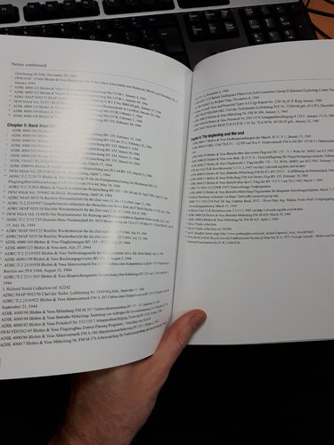
Secret Projects of the Third Reich: Blohm & Voss BV 155 has only one review on Amazon.co.uk to date and the writer of that review opines that the list of sources consulted, taking up four and a bit pages, is rather superfluous. What do you think - do the sources add anything at all or should I leave them out?
 
Keep them in place, please. If they are 1)books or 2)original sources, 1) helps me collect stuff and 2) shows places where more is to be learned.
I may not be your typical reader, mind.
 
Keep them in place, please. If they are 1)books or 2)original sources, 1) helps me collect stuff and 2) shows places where more is to be learned.
I may not be your typical reader, mind.

Indeed. None of my Luftwaffe: Secret volumes offered explicit notes on the source of the documents used but those titles really were designed to sell in supermarkets and I doubt casual readers were especially interested in learning exactly where the information included came from. However, the books are different, as you say. I'm currently working on Secret Projects of the Luftwaffe Volume 1: Jet Fighters - which is an overview of jet, rocket, pulsejet and ramjet fighter development in Germany during WW2. As mentioned elsewhere, rather than simply reprinting Luftwaffe: Secret Jets of the Third Reich, this is a ground-up rewrite and it's incredible how many more primary sources I have to draw on now than I had back in 2014/15. It's also interesting, having revisited every single source used for Luftwaffe: Secret Jets, how certain nuances within those documents make much more sense in the context of the more recently discovered material and allow me to paint a far clearer picture of what happened and when.
As with this new BV 155 book, showing the sources should allow anyone who is unsure whether to trust my version of events, compared with potentially contradictory material in other works, to seek out the original material and judge for themselves.
But as you say, perhaps this is overkill and people are simply willing to take what I write on trust. I'm sure many readers would much rather have slightly larger drawings throughout and lose the footnotes altogether.
 

Similar threads

Back
Top Bottom