The Secret Horsepower Race by Calum Douglas (and piston engine discussion)

Sorry, your phrasing made it a little unclear to me if your "sample" is supposed to be representing good or bad design ? Can you clarify which it is in your view?
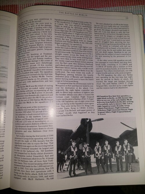
The sample is an example of a good layout and main font. The font is also stylistically spot on for technical subjects (the sample is from a, Finnish magazine on old vehicles). It is easy to read even in suboptimal lighting conditions. And it is designed to be readable even is small sizes.
 
I have a little time now to address some of the points raised.
The 'Clear Print' guidelines are primarily aimed at Public Sector information publications, such as, as sienar says, leaflets and pamphlets ( and the instructions for screening, and COVID, test kits for example), as well as utility bills, etc., and therefore not entirely appropriate for books and magazines. 12pt text, for example, is too big for a book, this would lead to an excessive page count (= cost).
The main point I was trying to make was this :-
'The font that you use should be clear in its design, without too many flourishes. Avoid ‘handwriting’ or ‘fancy’ fonts'
@Apophenia, @sienar; I'm afraid typography is as much a victim of fashion as anything else nowadays, so yes, 'make it look different to the old stuff' is indeed what happens, especially if you're selling a new edition of a book that has no additions or revisions to the previous edition . . .
@Paseolati, the 'Clear Print' guidelines only advise Left Aligned text, this does not automatically mean ragged right, fully justified is acceptable, indeed preferable. No more than two columns, though, as more leads to excessive word splitting, with or without hyphenation. Sorry, but your sample is foul, to use the word we would call that when i worked in the print trade, 'Tombstones' . . .
An example of good design that I would give would be Chris Gibson's Crecy titles.
Again,@Apophenia, your typography studies may have been in the late Pliestocene, but what you learned (apart from the basics) has definitely gone the way of the mastodon . . .

cheers,
Robin.
Why is my sample "foul"? And what is the Tombstone reference? 3 columns for a page width of about 21 cm is optimal. To Finnish "ears" the opposition of "word splitting" sounds honestly speaking that the opposition is intellectually challenged.

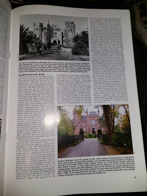
Attached another sample of an excellent layout, from After the Battle:
 

Attachments

  • 20240205_030727_compress24.jpg
    20240205_030727_compress24.jpg
    927.9 KB · Views: 16
Last edited:
I did some comparing. A Secret Horsepower Race page has a text density of (assuming a full page of text using main font, no quotes) about 5800 characters per page. I am attaching a sample from Hull, Hell and Halifax. It has a bit smaller format, but has a text density of about 8700 characters per page. The After the Battle sample is over 11,000 characters per page.
 

Attachments

  • 20240205_025746_compress40.jpg
    20240205_025746_compress40.jpg
    985.1 KB · Views: 12
An example of good design that I would give would be Chris Gibson's Crecy titles.
Again,@Apophenia, your typography studies may have been in the late Pliestocene, but what you learned (apart from the basics) has definitely gone the way of the mastodon . . .

cheers,
Robin.
Aw thanks Robin, the boys and girls at BEP and Crecy appreciate your kind words.

Screenshot_20231002_213137.jpg

Now, any chance we can get back to engines?

Chris
 
Pardon me, binged the thread.

first, I want to say Holy Crap this book is way cheaper than it has any right to be. I was fully expecting something like the books from Headstamp Publishing, which tend to run $75-100 US.

Now, on to comments.
Some may find this nitpicking but as a chemical engineer working at an American design company (retired now) I have seen through the years many mistakes being made with gallons as most of my coworkers, especially the younger ones, automatically assume that a gallon is 3.785 liters, even if it is mentioned in a clearly British document. I therefor have always urged coworkers to be careful when reading a document, and be clear which gallons one means when writing about them.

The same problem occurs in my profession with pressure units. Some people automatically assume that psi (or kg/cm2, or bar, or kpa, or Mpa, or ....) means absolute pressure, while others automatically assume it is gauge pressure. I have always insisted on my projects that everybody state either psig or psia, not psi, also clients. Assumption is the mother of all f#ck-ups.

In the top left corner of the two page preview there is a quote in which psi is mentioned. The numbers are big so in this particular case it does not really matter whether psig or psia is meant.
However there may be pressure data in the text of your book where psi (or kg/cm2, or bar, or kpa, or Mpa, or ....) are mentioned and where the number is small enough that it does make a difference whether psig or psia is meant.
Maybe you can think about that and let us know how to interpret pressure data without an a or g in your text before we start reading your undoubtedly interesting book.
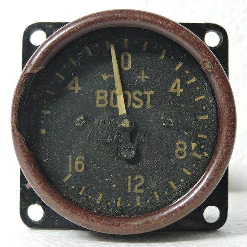
"Manifold Pressure" is always absolute, "boost pressure" is almost always gauge.

They're terms of art in the aircraft world.


For obvious reasons, the book does not go into jet engine development. Nevertheless, I got the feeling on reading some of the detail stuff on superchargers and turbochargers that it would not have been at all difficult to slide gently off into a side discussion of the impact of supercharger/turbocharger experience on early jet work (particularly the axial turbocharger the Germans were playing with).
What the?!? Okay, I want more details on this!


Nothing too intense but enough to put off most casual readers. The whole book isnt all like this, but perhaps 1/3 of it is. German engineers at the time didnt calculate supercharger output in the same way "we" did, plotting pressure ratio against flow (or corrected flow), instead they chose to use adiabatic work, (H_ad) so a fair bit of the book introduction is explaining for todays compressor engineer what thats all about. It has a couple of advantages, such as if you want to calculate the work of a multi-stage compressor, you just add together the adiabatic work of each stage. Up to a certain altitude, the "meters head" of this unit is "nearly" the same as the equivalent work to counter atmospheric, meters altitude rise - so if you want a supercharger to maintain sea level boost to 8000m, you can design one which produces an adiabatic work of 8000m. That starts not to quite hold true at very high altitudes, but its an interesting "guideline" for the aero engine designer to use.
That's honestly a really useful note, but I don't want to deal with heavy math anymore. I should probably get back in and re-do calculus at some point (did not do enough homework and so did just well enough to pass, but I was a business major so Calc was the last math class I had to take)

And given that useful guideline I can see why the Germans did the math that way.


Page 216 top left: "Maximum boost pressure was 44.2 in of mercury."
Was that 44.2 inch absolute, so +7 psi boost? Or 44.2 inch above 1 atm, so +21.7 psi boost?
I'm not an expert on the Sabre engine, but +7 psi seems low to me and +21.7 psi seems high, so I wonder which is correct here.
Okay, that's weird to say "boost pressure" and then use absolute units. Normally, "boost" is gauge pressure.

And yes, a 7psi boost really is all they were running back then. War Emergency Power for a Merlin is 61"Hg, ~15psi boost; normal max is ~55"Hg, ~12.5psi boost.


I keep wondering why the early gas turbines failed to accelerate as quickly as late model piston engines and, why the hybrids failed to bridge the gap. I understand materials were a problem until quite late on but I reckon a lot of it came down to political decisions and strategic investment.
Some of that comes down to prop versus jet. I don't have the math to explain why, but props always accelerate faster than jets. Even when the engine in question is a turboprop.

The hybrid engines like the 3350 Turbocompounds came out late in the war or missed it entirely, and did terrible things to engine reliability. The PRTs on the 3350s were sarcastically called "Parts Recovery Turbines" due to the low TBO and extra maintenance they caused.


I have rather a lot on the Orion, but as it never really ended up as much I had to decide to not put it into the book, as if you include all the "nearly" engines it quadruples in length, and its already a telephone directory in size.. so.. anyway.
I think a "director's cut" with all the "nearly" engines would be an awesome electronic copy, it's probably not worth the effort to publish it on paper.


I don’t believe, that the modifications have been well documented and many planes crashed and many racers died. On the other hand, it seems like the unlimited class came to an end and if there is any chance to write a book about it, it is now. No one has to keep their secrets without being able to race.
Racers are gonna race, last I heard was an airport in Wyoming was willing to consider hosting. I want to say Casper? The town hosts a rodeo, so they have a decent number of hotel rooms available for the racers and audience. And the Casper airport has a lack of whiny neighbors trying to get the entire airport shut down, which was the problem at Reno.


The upper sketch is somewhat mysterious, but basically what is being suggested is that under certain flight conditions the exhaust ejector effect produces a higher thrust efficiency compared to a turbo. Here Kosche suggests a mechanical 2 stage blower and a 213J with ultra high valve overlap and exhausts which are shaped to provide thrust. Here the engine is being used in a way which is possibly half-way between a normal piston aero engine and a turboprop in flight-speed/efficiency envelope. The power loss driving the oversized mechanical supercharger would be offset by the fact the flow from the supercharger is leveraged by the fuel chemical energy in the combustion chamber so that a lower amount goes to the prop than usual but a higher amount to exhaust thrust than usual.

I cannot comment on if this was thermodynamically practical or not.
That is a very weird idea... basically using the engine as a not-quite-motorjet?
 
Why is my sample "foul"? And what is the Tombstone reference?
Three columns on a 21 cm wide page may be your preference, I would prefer two columns. As seen in all of the Crécy books I own, which I find eminently readable.

Tombstones tend to be much taller than their width, this has consequences for any text on them. Your three-column page is readable, its layout reminds me of, well, tombstones. The comment by @robunos could refer to another layout issue. I would not decide against buying a book for its three-column layout, though.

I have a shelf which houses my old biology textbooks, half of them in single-column layout. Generally books that aren't as wide as the two-column books. None of them are in three-column layout. The contents are as dense as you might expect from university fodder, the layout and consequent readability are, in general, excellent.

All of the non-comics fiction on my shelves is in single-column layout. Some books badly presented, mostly due to unfortunate choices in font, some because an inappropriate kind of paper printed on.

With my comics, I cannot make out any rules for layout :confused:

First observation on The Secret Horsepower Race: I have no complaints at all about the main text's layout. The font used for quotes is good for distinguishing them from the main text, but slightly problematic as regards readability.

Second observation on the book: any reservations about readability of some parts are niggling concerns when set against the story told, style, general print quality and great value for money. No regrets at all in buying this.
 
Hi Scott,

Okay, that's weird to say "boost pressure" and then use absolute units. Normally, "boost" is gauge pressure.

Maybe you could briefly explain this for non-angloamericans? :)

I did a quick check of a random engineering dictionary site, and it defined "gauge pressure" as differential pressure measured against ambient atmospheric pressure.

As far as I know, all WW2-era "boost" pressure gauges measure absolute pressure, regardless of whether their scale in graduated from zero absolute pressure or from one standard atmosphere.

The implication maybe is that the historical British term "boost" wasn't applied consistently with the (modern) standard terminology?

Regards,

Henning (HoHun)
 
Hi Scott,


Maybe you could briefly explain this for non-angloamericans? :)

I did a quick check of a random engineering dictionary site, and it defined "gauge pressure" as differential pressure measured against ambient atmospheric pressure.

As far as I know, all WW2-era "boost" pressure gauges measure absolute pressure, regardless of whether their scale in graduated from zero absolute pressure or from one standard atmosphere.

The implication maybe is that the historical British term "boost" wasn't applied consistently with the (modern) standard terminology?

Regards,

Henning (HoHun)
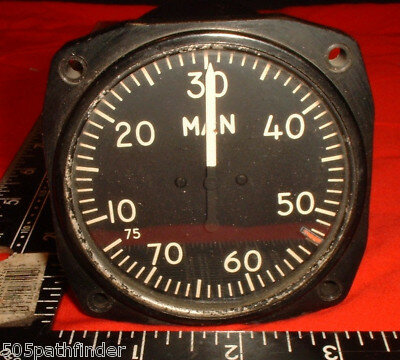
Normally, the aviation term is "manifold pressure" and is measured in absolute. And at least for US and UK planes, measured in inches of mercury. Haven't been able to stick my head inside a WW2 German plane to see if they measured in inHg (unlikely), cmHg, or kPa. Normal sea level atmospheric pressure is 29.92inHg, and at idle most piston engines are well below that. At wide open throttle a normally aspirated engine should be about 27inHg, maybe a little more. For supercharged or turbocharged applications, the manifold pressure will equal atmospheric at some RPM and then go above atmospheric as engine RPM increases until manifold pressure hits the regulated level. Excess supercharge boost is usually vented, excess turbocharger boost is a signal for the wastegate to open and allow some exhaust to bypass the turbo and slowing the compressor down.

"Boost" implies "above normal" so is gauge pressure, measured against atmospheric. Automotive boost gauges, for example, all measure relative to atmospheric.
 
Hi Scott,

Haven't been able to stick my head inside a WW2 German plane to see if they measured in inHg (unlikely), cmHg, or kPa.

The Germans measured in "ata", "atmosphere, technical, absolute". That's 1 kg (of force) per cm^2 ... metric still had the same mass/force ambiguity as Imperial back then. Pa would be modern, but that came in only after that ambiguity finally got eliminated in the 1970s.

(Soviets and French measured mm Hg absolute, Japanese mm Hg against standard atmosphere.)

"Boost" implies "above normal" so is gauge pressure, measured against atmospheric. Automotive boost gauges, for example, all measure relative to atmospheric.

Between the British and the US, boost and manifold pressures were pretty much treated as if they were direct equivalents, which wouldn't really have worked if the pressure were actually measured differentially against ambient atmospheric pressure. I really can't imagine that it was anything but ambiguous terminology for two ways of expressing absolute pressure.

Hm, wait ... I actually have a pretty technical book here, "The Performance of a Supercharged Aero Engine" by Hooker, Reed and Yarker. It's a bit on the theoretical side, but it defines: 'Fc - Boost or charge pressure - "Hg abs.'.

So at least these three Rolls-Royce engineers didn't shy away from applying the term "boost" to an absolute pressure :)

Regards,

Henning (HoHun)
 
Regarding engines, one thing has bothered me for a while: Why most major engines were only SOHC? When one compares the valve gear of the Mikulin AM-38 with its DOHC vs. others, one immediately noted how many many fewer parts the valve gear has. Second, a DOHC would allow much more room to place spark plugs in the center of the Combustion chamber.
 
Tombstones tend to be much taller than their width, this has consequences for any text on them. Your three-column page is readable, its layout reminds me of, well, tombstones.
That's exactly what I meant . . . because the lines of text are so short, unless you adopt ragged right formatting, you are forced to accept a lot of word splitting between lines, with the consequent hyphenation. The short lines also mean lots of quick left-right eye scanning, whereas longer text lines produce a more 'leisurely' right scan followed by a less frequent left 'return' scan.
Also, I don't see the point of maximising character density at the cost of readability . . .

cheers,
Robin.
 
Hi Robin,

The short lines also mean lots of quick left-right eye scanning, whereas longer text lines produce a more 'leisurely' right scan followed by a less frequent left 'return' scan.

That's actually an advantage if you're using varifocals. I'm just in the process of reading a large format book with nice large print, but it's still annoying as heck, as I have to turn my head with each line to keep the "sharp" area on the text.

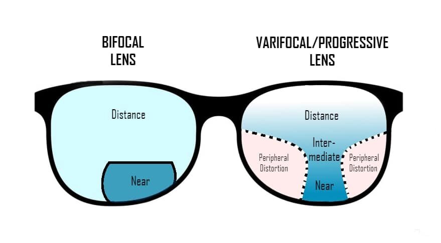
Here's a diagram showing the problem with varifocals:

Bifocal-vs-Varifocal-1.jpg

Note the narrowness of the area marked as "near". Additionally, there's only a small vertical angle in which the "near" area actually allows focussing at a certain distance.

So to keep everything in the sharp area, one has to move the entire head constantly in azimuth and elevation, as relying on eyeball movement alone would make one miss the "sweet spot of sharpness".

It's possible to accept the decreasing sharpness at the edges of the narrow "near" area to have a bit more relaxed reading experience by simply not turning the head and relying on the brain to figure out the fuzzy letters, but unfortunately, the "Horsepower Race" in the first edition uses a font for the quotes that's a bit fuzzy itself. Aesthetically, I do actually like the font, but it just makes reading the book less pleasant than it would otherwise be.

By the way, the German edition has a different front and also a different book format, which in combination work a lot better for me than the larger English edition. (Smaller books are more easily manipulated by the reader to get the best ergonomics despite their smaller format, which means that I might be fine with a font size in a small book I'd consider too small in a larger format.)

Regards,

Henning (HoHun)
 
That's exactly what I meant . . . because the lines of text are so short, unless you adopt ragged right formatting, you are forced to accept a lot of word splitting between lines, with the consequent hyphenation. The short lines also mean lots of quick left-right eye scanning, whereas longer text lines produce a more 'leisurely' right scan followed by a less frequent left 'return' scan.
Also, I don't see the point of maximising character density at the cost of readability . . .

cheers,
Robin.
The ideal line width is 5 - 7 cm. Thus with A4ish formats the full page width is exploited to the full. And the shorter lines are also much quicker to read, especially when one reads the text in segments and thinks about it before reading more. Thus your comment on "leisureness" verifies my view that shorter lines are much more effective way to present the text.

As for "forced" word splitting/hyphenation, so what? Are English-speaking natives incapable of under-standing hyphe-nation?

As for maximising character density: did you miss Calum's note that he had to delete a substantial number of illustrations to keep within the allotted page count? If one is allotted say 400 pages, it makes a major difference to what else can be included if the pages required for the text can be reduced by say 50 pages. More bang for every buck.
 
The cost of printing a book is fixed by the number of pages. I ended up reducing text size and adopting three columns to fit to 64 pages for my P.1121 book compared to earlier Project Tech volumes.

Following the Crecy layout, it would never have fit to 64 pages and I would have had to cut text or pictures out or made it longer and cost more. 96 pages would have allowed larger pictures, but the cost to print would be +50%.
 
Regarding engines, one thing has bothered me for a while: Why most major engines were only SOHC? When one compares the valve gear of the Mikulin AM-38 with its DOHC vs. others, one immediately noted how many many fewer parts the valve gear has. Second, a DOHC would allow much more room to place spark plugs in the center of the Combustion chamber.
Aircraft engines use double spark plugs for reliability (and to efficiently burn fuel in those very wide combustion chambers), double overhead cams would put the cams in the way of the spark plugs.
 
It depends. Car and motorcycle DOHC engines with 4 poppet valves per cylinder generally have a single spark plug in a central position. Two spark plugs are fitted in line parallel to the camshafts.
 
On page layout: there appears to be no way to find a layout that perfectly fits everyone's needs. Be that to accomodate readers' wishes, or to bring down printing costs.
I had another look at Paul's P.1121 book. Not ideally suited to my preferences - but then, which book is - but a compromise that certainly works well enough for me, at a reasonable price. Cheap, considering the limited print run.
I appreciate the valuable points made by @HoHun , it's just that my eyesight works differently, hence my needs are different. Then, there's what I'm used to. There are newspapers that put me off because they present their news in a layout that differs from the two or three dailies I grew up with. Wrong font, chocolate letter headers.

Perfectly suit individual readers' needs? About twenty years ago, I bought my mother a large-letter edition of The Da Vinci Code, at roughly double the price of the regular edition which was simply unreadable for her. Well worth the money at the time.

Compromises, compromises. You make your choices, you live with the consequences.
 
Aircraft engines use double spark plugs for reliability (and to efficiently burn fuel in those very wide combustion chambers), double overhead cams would put the cams in the way of the spark plugs.
Not so. Take a look at the Jumo 213. The plugs are in the center of the cylinder "in-line" (if looking along the crankshaft line) and with double camshafts, the would be no interference between the plus and the shafts.
 
The cost of printing a book is fixed by the number of pages. I ended up reducing text size and adopting three columns to fit to 64 pages for my P.1121 book compared to earlier Project Tech volumes.

Following the Crecy layout, it would never have fit to 64 pages and I would have had to cut text or pictures out or made it longer and cost more. 96 pages would have allowed larger pictures, but the cost to print would be +50%.
Where can one see the layout of the P.1121 book?

Regarding Crecy, the layout in Tony Buttler's Propeller Twilight is very poor. The font is bad, there is lots of blank areas etc.
 
Hi Arjen,

I appreciate the valuable points made by @HoHun , it's just that my eyesight works differently, hence my needs are different.

Not a problem at all! I just meant to discuss one specific issue that probably affects a sizable proportion of the readership, which also happens to be one that has practical ergonomic effects that are not obvious to anyone who isn't affected himself.

Myopia seems to affect around 25 % of the adult population, and basically everyone gets hit by presbyopia by the age of 50 or something, with the intersection being the likely users of varifocals.

Accessibility of course is meant to (ideally) address everyone's needs, so a different perspective is totally fine :)

Regards,

Henning (HoHun)
 
Aircraft engines use double spark plugs for reliability (and to efficiently burn fuel in those very wide combustion chambers), double overhead cams would put the cams in the way of the spark plugs.

If you look on the maximum flame travel distances, you will clearly see that one central spark plug is a better solution for efficient burn rates. Of course, two spark plugs offer greater reliablility which was especially important when spark pluf fouling was very prominent due to the high lead content.

The Ford GAA motor was intended to have central plugs if I'm right, at least the tank version had it. This motor looked indeed much more like a modern engine than it's contemporary rivals. It was a DOHC layout which enabled accsess to the center of the head.

On drawback of DOHC engines is the additional weight and frontal area, this was surly the main argument against it.
Additional weight? How much? Basically the weight added is the camshaft, the removed weight is: rockers, rocker mountings/spindles. As for frontal area, again a very minimal difference (compare e.g. the AM-38 vs. Merlin valve covers).
 
Typically DOHC will slightly increase the cross section of the rocker boxes, (this is mostly a function of the diameter of the driving gears not the fact there is an extra cam there) and hence fractionally increase the frontal area. It will also increase the weight of the engine a little.
 
Not so. Take a look at the Jumo 213. The plugs are in the center of the cylinder "in-line" (if looking along the crankshaft line) and with double camshafts, the would be no interference between the plus and the shafts.
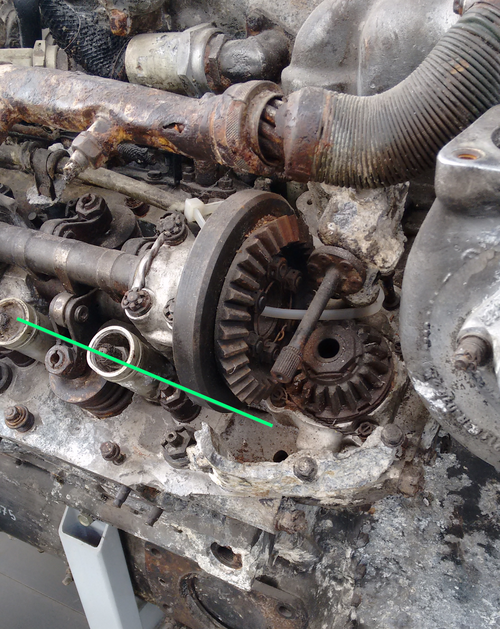
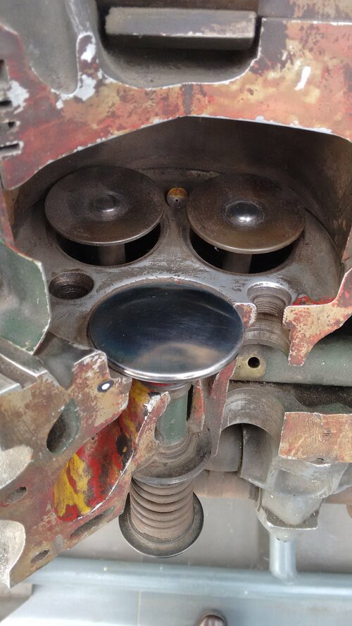
Its important to add that they PROTRUDE into the chamber in the middle, but there was a bit of artistic design required at the other end...

1707252316924.png
 
Compromises, compromises. DOHC comes into its own at high RPM where minimal valve train inertia is essential. For lower revving engines (like aero engines) the space freed up by having just a single cam is very valuable. Finger followers etc give you options for easier valve clearance adjustment and roller followers to lower wear and friction.
 
Additional weight? How much? Basically the weight added is the camshaft, the removed weight is: rockers, rocker mountings/spindles. As for frontal area, again a very minimal difference (compare e.g. the AM-38 vs. Merlin valve covers).

Please note, that some kind of follower will also be needed for DOHC cams and those, like finger followers must be attached to something or in case of tappets must be guided by something. Also the cams need bearings and gears to drive them. Its worth the effort in high rpm engines, but I doubt that the valve train was the limiting factor for the max. rpm.

The spark plug position om the Jumo 213 is a bit like in the Mercedes 3 valve engines of the 90th. Here in the Jumo, the three valve design allowed a better plug position than the four valve aero engines of its time.

I guess one reason against a central spark plug were potential cooling issues in the center of the head. Also note with one spark in the center and one on the the side (like Alfa did it some years ago) you would need different spark timing for both plugs, otherwise the engine will tend to knock heavily if the center plug would fail.
 
The ideal line width is 5 - 7 cm. Thus with A4ish formats the full page width is exploited to the full. And the shorter lines are also much quicker to read, especially when one reads the text in segments and thinks about it before reading more. Thus your comment on "leisureness" verifies my view that shorter lines are much more effective way to present the text.

As for "forced" word splitting/hyphenation, so what? Are English-speaking natives incapable of under-standing hyphe-nation?

As for maximising character density: did you miss Calum's note that he had to delete a substantial number of illustrations to keep within the allotted page count? If one is allotted say 400 pages, it makes a major difference to what else can be included if the pages required for the text can be reduced by say 50 pages. More bang for every buck.
Ideal line width 5-7cm, evidence please . . .
Of course English speakers can understand hyphenation, but why do it when you don't have to ? In a subject like aerospace technology, there are lots of long words, so why keep splitting and thus hyphenating them, when by simply increasing the line length, you can leave them intact ?
I understand that decreasing character density increases page count and therefore cost, thirty years in the print trade taught me that, if nothing else, but how far do you go ? You could set everything at 4pt in a condensed or narrow font, the book would have very few pages and thus be cheap, but would you want to read it ? It would be like those leaflets that come with medication . . .
The thing is, these books are not text books. I buy such a book because I want to read it, not because I have to, and therefore i want the experience of reading said books to be a pleasure, rather than a chore, I neither want, nor need, to extract the knowledge within these books as 'effectively' ( read quickly ) as possible, I can, and will, take my time . . .

cheers,
Robin.
 
Its important to add that they PROTRUDE into the chamber in the middle, but there was a bit of artistic design required at the other end...

View attachment 719289
Thanks for the photo! I have tried to find a clear illustration of the 213 head with valve gear fitted. Even the drawings of the Ersatzteilliste leave room for clarity.
 
Ideal line width 5-7cm, evidence please . . .
Of course English speakers can understand hyphenation, but why do it when you don't have to ? In a subject like aerospace technology, there are lots of long words, so why keep splitting and thus hyphenating them, when by simply increasing the line length, you can leave them intact ?
I understand that decreasing character density increases page count and therefore cost, thirty years in the print trade taught me that, if nothing else, but how far do you go ? You could set everything at 4pt in a condensed or narrow font, the book would have very few pages and thus be cheap, but would you want to read it ? It would be like those leaflets that come with medication . . .
The thing is, these books are not text books. I buy such a book because I want to read it, not because I have to, and therefore i want the experience of reading said books to be a pleasure, rather than a chore, I neither want, nor need, to extract the knowledge within these books as 'effectively' ( read quickly ) as possible, I can, and will, take my time . . .

cheers,
Robin.
Evidence? For example, a statement (via e-mail) by Kari Stenman who has written and published tens of aviation history books. He told me that layout professionals' (old school) term for ragged-right was "twig-arse layout".

You may love to maximize reading time per book, I don't given that I have well over 100 books in my own collection alone waiting to be read.

As for hyphenation, it is inevitable regardless of line length if space usage is to be properly optimized.

None of the examples I have attached have had font size that gives normal readers any issues. Hell, I have glasses closer to -10 in correction, I have no trouble reading even Jane's AWA, a very small-font book. Besides, for those with serious sight issues there are devices where one can put a book/magazine on it and the device enlarges the text on a screen up to very large sizes. A distant relative of mine has had one since 1980s.

On the other hand, text left out due to large font is impossible to be read at all.

And the cost issue is a major one as noted by Calum how expensive overseas shipping is when the book weighs over 2 kg. Increasing page count through a "leisure" layout creates cumulative cost increases at every stage from printing to final sales. Real foolishness.
 
Hi Robin,


That's actually an advantage if you're using varifocals. I'm just in the process of reading a large format book with nice large print, but it's still annoying as heck, as I have to turn my head with each line to keep the "sharp" area on the text.

Here's a diagram showing the problem with varifocals:

View attachment 719205

Note the narrowness of the area marked as "near". Additionally, there's only a small vertical angle in which the "near" area actually allows focussing at a certain distance.

So to keep everything in the sharp area, one has to move the entire head constantly in azimuth and elevation, as relying on eyeball movement alone would make one miss the "sweet spot of sharpness".

It's possible to accept the decreasing sharpness at the edges of the narrow "near" area to have a bit more relaxed reading experience by simply not turning the head and relying on the brain to figure out the fuzzy letters, but unfortunately, the "Horsepower Race" in the first edition uses a font for the quotes that's a bit fuzzy itself. Aesthetically, I do actually like the font, but it just makes reading the book less pleasant than it would otherwise be.

By the way, the German edition has a different front and also a different book format, which in combination work a lot better for me than the larger English edition. (Smaller books are more easily manipulated by the reader to get the best ergonomics despite their smaller format, which means that I might be fine with a font size in a small book I'd consider too small in a larger format.)

Regards,

Henning (HoHun)
Thank you for explaining why I hate “progressive” lenses.
I tried them while driving a city bus and it took me too long to understand that the distance vision portion was only a narrow strip across the top edge.
I discarded them in favour of bifocal lenses and insisted on custom bifocals where the split/seam goes across the top of the instrument panel on the bus.
 
Hi Rob,

Thank you for explaining why I hate “progressive” lenses.
I tried them while driving a city bus and it took me too long to understand that the distance vision portion was only a narrow strip across the top edge.
I discarded them in favour of bifocal lenses and insisted on custom bifocals where the split/seam goes across the top of the instrument panel on the bus.

That's fascinating ... I recently found that two engineers I know had independently of each other also decided to give bifocals a try, and your description reminds me of trifocals that were specially made for pilots, split into main instrument panel - outside view - overhead panel divisions.

Your optometrist probably never had airline pilot customers, otherwise he (or she) should have understand your requirements right away!

Regards,

Henning (HoHun)
 
Hi Pasoleati,

Hell, I have glasses closer to -10 in correction, I have no trouble reading even Jane's AWA, a very small-font book.

-10 dpt is actually helping to compensate for presbyopia, so you're acually at an advantage there. It moves the effective minimum accommodation distance closer to your eyes, so it makes perfect sense you can handle very small fonts well.

However, the Duane curve I posted above shows the eye losing its accommodation capability with age, so you might not be immune to the effect, it will only show up at a more advanced age than for lesser mortals ;-)

Regards,

Henning (HoHun)
 

Thanks, we can clearly see,that the plugs are at least closer to the center than on the contemporary 4 valve aero engines. It is also clear, that there was no room for a central spark plug with the given size of the valves and the spark plug thread.

The Ford GAA hat a relative (compared to aero engines, not car engines of that time) large valve angle which enabled the central plug.
 
Anyone knowing whether Kevin Cameron is still active? He had s regular column in the AEHS Journal Torque Meter and he wrote a lot on the problems of the R-3350. It is strange that no detailed book exists on the R-3350.
 
Anyone knowing whether Kevin Cameron is still active? He had s regular column in the AEHS Journal Torque Meter and he wrote a lot on the problems of the R-3350. It is strange that no detailed book exists on the R-3350.
Not sure but the Royal Aeronautical Society have just asked me to write a review of this (a review copy is in the post), it may be of interest to air-cooled engine fans. It appears to be mostly about the industrial side of production rather than a detailed treatise on the engine design aspects. I cannot comment more until I`ve read it. It is based on a PhD thesis, so is I imagine on the more academic side of style of writing, so hopefully contains a fair bit of original primary source research. The book definitely has some material on the R-3350 manufacturing.

1707947323187.png
 
Last edited:
Just my ten pence worth, I would rather pay a bit more and have the larger font, more pages. I understand other opinions are valid but, if I am interested in a topic I want the best and that means paying for quality over quantity.

In other words, books I can read rather than sit on my bookshelf collecting dust.

This getting old eyes is not funny at all.
There are magnification devices for those requiring bigger font.
 

Similar threads

Back
Top Bottom