Back in the 1950’s and 1960’s - you know, when there was actual progress in aerospace - aerospace companies and organizations had people on staff who were paid, skilled artists and draftsmen. Many of even the simplest presentations were thus filled with high-quality sketches, drawings, artwork, photos of scale models, etc. But in recent years, certainly since before my aerospace career began in the mid 90’s, there has been a consolidation of skills into a smaller and smaller group of people. I often heard tales of how the floor of the office was ringed with engineers on the outside, filled with draftsmen in the middle, and had secretaries/technical writers on the ends. The engineers would crunch the numbers, the draftsmen would make the drawings, the secretaries and writers would write up the reports (often using little more than random scribbles and scraps scrawled by the engineers). The system may have been unweildy and inefficient, but obviously it worked.
But with the rise of the personal computer, word processing programs and CAD programs, the apparent “need” for the non-engineers declined. Why have a draftsman when the engineer can do the drafting himself? Who needs a secretary when the engineer can do the writing himself?
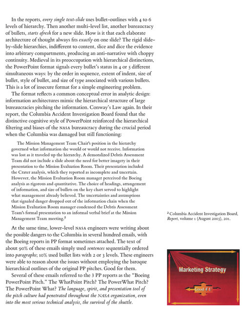
")