- Joined
- 27 December 2005
- Messages
- 16,497
- Reaction score
- 19,297
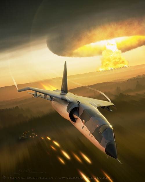
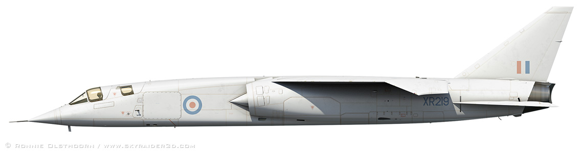
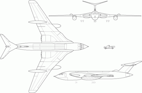
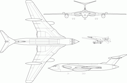
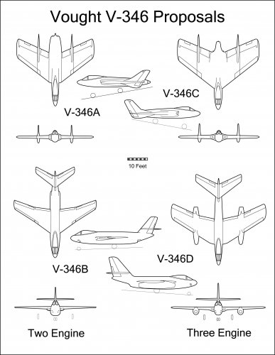
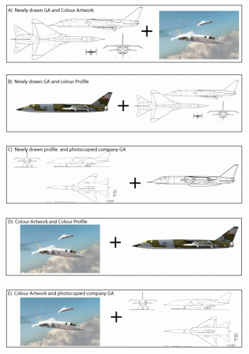
From Chris Gibson
1) Which combination of images, A,B,C,D or E, would you prefer to see in a book?
2) Which option, A,B,C,D or E, would you consider worth paying a premium for?
3) Assuming none of these are freebies, which combination, A,B,C,D or E, would you consider the most costly to produce?
4) Any combinations of the individual images not shown here that they would like to see?
Some idea of reasons for selection / comments would be nice, as the results could have an impact on future production. Don't moan if you don't contribute!
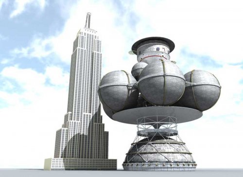
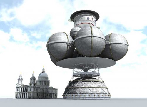
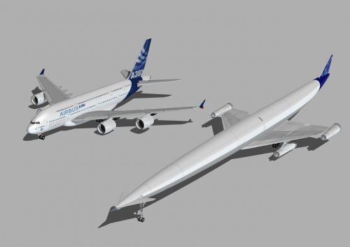
Please note these are all very low resolution and do not reflect production quality.
Thanks
Chris
") Aviation book is mostly some kind of the history book. If you have all new material in it, the spirit will lack. Of course, this is my individual preference. If someone has the different opinion, its nothing bad with that.
Aviation book is mostly some kind of the history book. If you have all new material in it, the spirit will lack. Of course, this is my individual preference. If someone has the different opinion, its nothing bad with that.