sgeorges4
I really should change my personal text
- Joined
- 8 October 2017
- Messages
- 665
- Reaction score
- 334
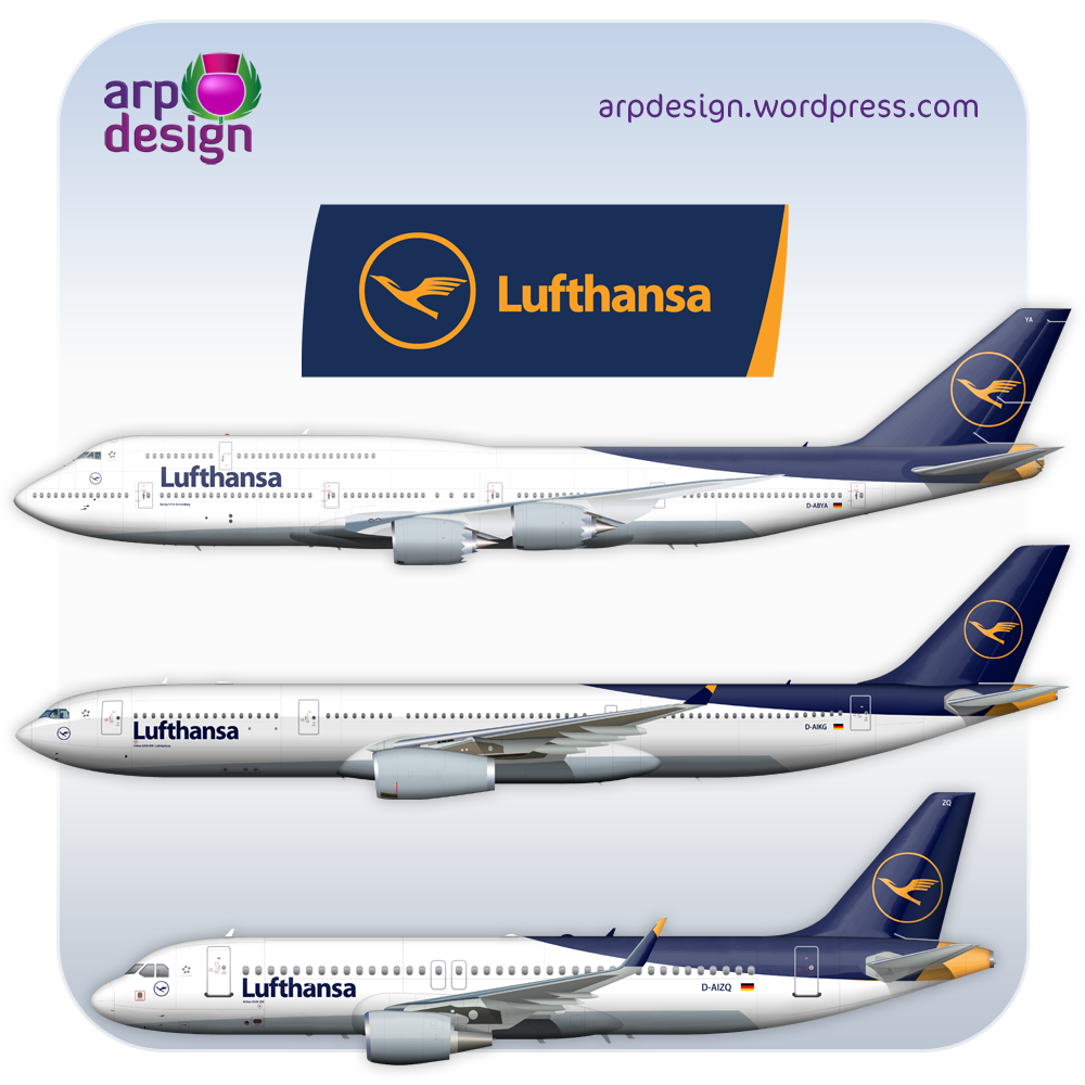
Hello, I've seen some concept regarding the new livery pop up but it seem that only 4 are official, the other are rumor such as this one

these seem to be official concept
An explanation for it(I still don't get why there was so much drama regarding this livery,personnaly I like and it's much simpler to do in model) https://airwaysmag.com/airlines/exc...a-explains-its-new-livery-why-dropped-yellow/
Thanks for your answer!
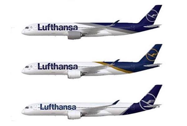
these seem to be official concept
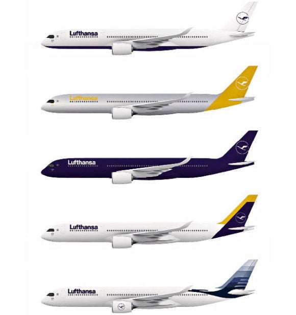
...and if Lufthansa would decide to change livery? - Page 11 - Wings900 Discussion Forums
This looks palatable, but still bad
www.wings900.com
An explanation for it(I still don't get why there was so much drama regarding this livery,personnaly I like and it's much simpler to do in model) https://airwaysmag.com/airlines/exc...a-explains-its-new-livery-why-dropped-yellow/
Thanks for your answer!