Creating the logo for the space agency

Matej

Multiuniversal creator
Joined
13 February 2006
Messages
2,607
Reaction score
421
Website
www.hitechweb.genezis.eu
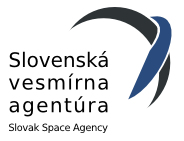
Probably a bit offtopic, but I have the unique opportunity to create the logo for our own national space agency, that is going to be established. In the philosophic point of view I want to understand, what the people in general expects from such a logo. What it should represent, which symbols, colours, which of the current space agency logos do you like and why, which you dislike and why... Any inspiration word is welcome.
 
I forget, what country?
 
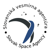
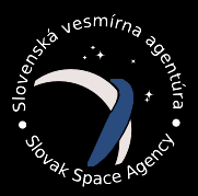
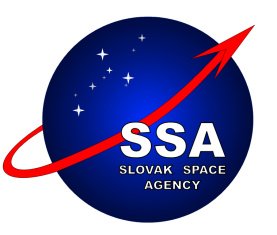
Slovakia. All our current space activities are going to merge in some way and after a few years, we plan to be the member of the ESA. Those are a few (not mine) examples to begin with. There will be the competition with a few participants and I have the strong motivation to win :)
 

Attachments

  • abbr.png
    abbr.png
    10.8 KB · Views: 3
  • cubic.png
    cubic.png
    10.6 KB · Views: 131
  • round.png
    round.png
    12.5 KB · Views: 179
  • slovak_wide.png
    slovak_wide.png
    17.1 KB · Views: 3
This is my very first idea:

- national colours
- blue to represent the earth and peace
- going dark on the edge to represent the darkness of space
- the most important: I am going to work on the red line to represent the step-by-step process, that is typical for us. We had to do a lot of small steps from nothing (creating the independent republic, building it, make the respect in the international enviroment, join the important international institutions such as EU, NATO, OECD..., have the first astronaut, create the own space agency, develop and manufacture the first domestic satelite (I did the logo for it some month ago), after a few years join the ESA and who knows what else).
 

Attachments

  • SSA_initial.jpg
    SSA_initial.jpg
    26.8 KB · Views: 114
Bottom one looks too much like the NASA "meatball" IMO. Black ones might look strange on a white background.
 
Your initial project was well done, Matej, but it's been done before. The new series you presented above is not only more original, but it is A LOT more modern! You can see a planet with a ring in it, but also a soaring bird (isn't this an emblem of Slovakia?).
 
I like round.png as well.
You can see the earth crescent and the logo also conveys a sense of strength that is very hard to obtain with simple geometries. Very nice.
--Luc
 
Not very convinced about the arrow.
I'll use a darker red for the arrow tip and I'll stylish/sharp it a bit looking for a delta wing space ship look.
 
pometablava said:
Not very convinced about the arrow.

This is only the first "something" that I did in less than 5 minutes, using the material from the first mission patch. You shouldn't take it much seriously. Just to begin with. Now I am only in the process of the research to find out, what represents our space program, what we did in past and what are our goals. Only then I can decide about the shapes and colours and explanation of them.

I also like the previous series, especially because its simplicity and very easy scaling, but I have also two strong objections against it:

1. It is too sterile. I mean that it has in fact nothing to do with us. If you leave only the text "SSA", it can be without any problem the logo of the space agency of Sweden, Singapore or Somalia and nobody even notice it. If you read the link that I posted at the beginning of this topic, the chinese logo has its background - every shape, every single line has its explanation. The previous series has only "looks cool" factor, but nothing beyond. This approach is usefull, when designing the logo for the private commercial company, but I doubt that it will be the best way for the space agency.

2. It does not work very well on the dark background. I tried to make a simple brochure with the black and black/stars background and it does not look so good as on the white one. You can see it in my reply no.5.
 

Attachments

  • skcube_v2_0.jpg
    skcube_v2_0.jpg
    27.1 KB · Views: 78
I would vote for the logo "Round.png" as well. I would presume that it would be important for a national space agency to have its name in its national language, not exclusively in English. I do like that the logo appears not only like a planetary body with a ring, but also, as has been pointed out, looks like a bird in flight. I also like the stars as well in the design.

Perhaps colors could be changed in the logo to use the Slovak national colors of white, red, and blue? Perhaps the Slovak Coat of Arms could be incorporated into the design?
 
"Round.png" is the best one of all. ;)

Looks like everyone else pointed that out too. LOL ;D
 
Hm, this means something. I will ask for the original .cdr material and try to optimize it a bit for the dark background and play with the colours. Lets see how it ends.
 
I get the inspiration!

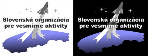
This is the new general concept that I made during the last few minutes. Detailed optimisation (mostly separating the text from the background, tuning the sizes of the objects and so) was not yet done, but in general it will look like this.

If I should describe it in one word, than it represents the unity. It is based on the one of our oldest and most important folktale about the king Svätopluk and his message to his sons. The three strips represents the three canes. The message is, that you can easily break each separate cane, but when you join them together, you will be no longer able to do so. So when we want to achieve such a difficult goal as the space exploration, every part of our country must join together and work in unity. The strips also represents the grayscale version of our flag. Bottom part can be interpreted as our "blue home" Earth, but it is also the stylized contour of the Slovakia. The flying vehicle on the top (NASP fans will like it) represents the inspiration. When I thought about what inspired me to start interest in aviation, it were mostly the futuristic cool looking space ships (usually from Startrek).
 

Attachments

  • SSA_new_concept.jpg
    SSA_new_concept.jpg
    21.8 KB · Views: 9
As far as I'm concerned, none of your projects so far beats this particular one:

index.php
 
i like this one
index.php


Matej, you try also with national colors of Slovakia als "exhaust" ?
 
I tried, but it was too patchworky and knowing the taste of the customer, I think that he will like this colour scheme much. I finished the final version and I am going to compete with this one. BTW the name of the organization changed to Slovak organization for space activities. Probably because in short SOVA can be translated as "owl", which is the symbol of the braininess and canniness

I think that this logo can also cooperate with my mission patches, that were already approved.
 

Attachments

  • SOVA.jpg
    SOVA.jpg
    52.3 KB · Views: 5
  • mission_patches.jpg
    mission_patches.jpg
    62.1 KB · Views: 5
Dear Matej,

I personally prefer round.png. It is clean-cut, simple, shows the graceful curvature of the earth, and has a good color-selection, with abbr.png as a back-up.

While I cannot speak knowledgeably about the grammatical nuances of Slovakian, but I would have the first letters of each word capitalized as in Slovenska Vesmirna Agentura (Unless it is grammatically incorrect, that is)
 

Similar threads

Back
Top Bottom