
You are using an out of date browser. It may not display this or other websites correctly.
You should upgrade or use an alternative browser.
You should upgrade or use an alternative browser.
Design and layout of books, magazines and ebooks
- Thread starter Pasoleati
- Start date
- Joined
- 25 June 2014
- Messages
- 1,564
- Reaction score
- 1,499
Re: Design and layout of books and magazines
There's tight. there's loose, and there's beautifully balanced. Slightly larger text, wider margins, one or two justified columns rather than three ragged, less shiny and slightly thicker paper, maybe even an Index, and suddenly you have a good-quality 200-page book. Worth taking the idea of a second edition to a regular publisher, if you can sort out the copyright with Mortons.
Pasoleati said:I love tight layouts! There are few things more deserving the capital punishment that loose, "airy" layouts!
There's tight. there's loose, and there's beautifully balanced. Slightly larger text, wider margins, one or two justified columns rather than three ragged, less shiny and slightly thicker paper, maybe even an Index, and suddenly you have a good-quality 200-page book. Worth taking the idea of a second edition to a regular publisher, if you can sort out the copyright with Mortons.
- Joined
- 25 June 2014
- Messages
- 1,564
- Reaction score
- 1,499
Re: Design and layout of books and magazines
Would Mortons consider that? If they could run to a thicker grade cover, that would be good.
3-column fully justified is generally held to look awful. But really, you are just saying, republish the bookazine.Pasoleati said:No to bigger font! No to wider margins! Yes to fully-justified, with 3 columns and 10 pt Adobe Jenson Pro.
Would Mortons consider that? If they could run to a thicker grade cover, that would be good.
- Joined
- 25 June 2014
- Messages
- 1,564
- Reaction score
- 1,499
Re: Design and layout of books and magazines
I expect they just clicked some "Publish as .. > Kindle" option and have no clue how it works/doesn't work. I could probably sort it for them, but it would cost.
CJGibson said:They should sort out the Kindle version or give me my money back first!
Chris
I expect they just clicked some "Publish as .. > Kindle" option and have no clue how it works/doesn't work. I could probably sort it for them, but it would cost.
- Joined
- 11 June 2014
- Messages
- 1,541
- Reaction score
- 2,899
Re: Design and layout of books and magazines
I like your optimism but I think the problem is intractable. There are 87,000 words and 332 separate image files in Secret Bombers (compared to 85,000 words and 346 images in Secret Jets), each of the original image files being larger than 3MB (mostly much larger). I believe the maximum filesize for a KDP book is 650MB (although some sources quote as little as 50MB). Even given the dramatic compression that takes place when files are uploaded into the 'kindle format' it still becomes unwieldy. Sadly Kindle is not a medium that lends itself easily to heavily illustrated works.
Regarding a straight reprint, I'd say it was unlikely. And besides which, it's been a year and a half since I completed Secret Jets and I now have roughly five times as much source material as I did back then. If I wrote an actual book on German projects retreading the same ground it would probably be... slightly different.
steelpillow said:CJGibson said:They should sort out the Kindle version or give me my money back first!
Chris
I expect they just clicked some "Publish as .. > Kindle" option and have no clue how it works/doesn't work. I could probably sort it for them, but it would cost.
I like your optimism but I think the problem is intractable. There are 87,000 words and 332 separate image files in Secret Bombers (compared to 85,000 words and 346 images in Secret Jets), each of the original image files being larger than 3MB (mostly much larger). I believe the maximum filesize for a KDP book is 650MB (although some sources quote as little as 50MB). Even given the dramatic compression that takes place when files are uploaded into the 'kindle format' it still becomes unwieldy. Sadly Kindle is not a medium that lends itself easily to heavily illustrated works.
Regarding a straight reprint, I'd say it was unlikely. And besides which, it's been a year and a half since I completed Secret Jets and I now have roughly five times as much source material as I did back then. If I wrote an actual book on German projects retreading the same ground it would probably be... slightly different.
Pasoleati
I really should change my personal text
- Joined
- 29 June 2012
- Messages
- 551
- Reaction score
- 224
Re: Design and layout of books and magazines
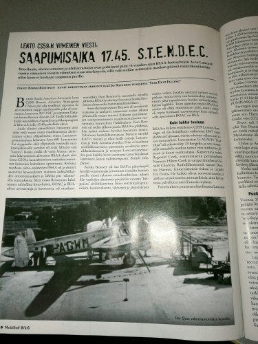
Generally held by whom? 15-year-old semi-illiterates looking for pretty pictures of some [deleted] musicians? 3-column fully-justified is the standard on e.g. After the Battle books. It is also the choice of a Finnish classic vehicles magazine Mobilisti. Absolutely perfect for readability and tidy style (vs. drunken vomit).
steelpillow said:3-column fully justified is generally held to look awful. But really, you are just saying, republish the bookazine.Pasoleati said:No to bigger font! No to wider margins! Yes to fully-justified, with 3 columns and 10 pt Adobe Jenson Pro.
Would Mortons consider that? If they could run to a thicker grade cover, that would be good.
Generally held by whom? 15-year-old semi-illiterates looking for pretty pictures of some [deleted] musicians? 3-column fully-justified is the standard on e.g. After the Battle books. It is also the choice of a Finnish classic vehicles magazine Mobilisti. Absolutely perfect for readability and tidy style (vs. drunken vomit).
- Joined
- 27 December 2005
- Messages
- 17,748
- Reaction score
- 26,408
Re: Design and layout of books and magazines
Ragged-right versus justified is a bit of a personal preference. Justified looks nicer to me, as it makes the overall design of the page more attractive. Well done justified text just looks more professional to me, ragged right looks like was just run up in a word processor not lovingly laid out by a professional. I think older readers may differ from younger ones on this.
Unfortunately Word is pretty awful at justification, and many people's view of justification is skewed by their encounter with terribly justified Word documents.
Some research shows that ragged-right is easier to read for younger or less skilled readers as the regular word spacing is easier to navigate than variable word spacing and the uneven line lengths may be helpful in not losing your line. Most studies show no difference in ease of reading for skilled readers however.
If the end object is readability for readers of all abilities, ragged-right may be preferable. If the end object is a beautiful page, I think justification is justified.
Note my P.1121 ProjectTech was laid out in justified text, no other volume in the series has been.
- Joined
- 25 June 2014
- Messages
- 1,564
- Reaction score
- 1,499
Re: Design and layout of books and magazines
* (Nothing personal, my art teacher used to call us all "dear boy").
LOL. My children are older than that. By experienced professionals, dear boy*, though it sounds as if you have never met one.Pasoleati said:Generally held by whom? 15-year-old semi-illiterates looking for pretty pictures of some [deleted] musicians?
* (Nothing personal, my art teacher used to call us all "dear boy").
Pasoleati
I really should change my personal text
- Joined
- 29 June 2012
- Messages
- 551
- Reaction score
- 224
Re: Design and layout of books and magazines
It is also quite telling to note that the ragged right did not raise its ugly head until late 1990s/ early 2000s, correlating with the decrease in literacy in the West and the reduction of attention span among younger people.
It is also quite telling to note that the ragged right did not raise its ugly head until late 1990s/ early 2000s, correlating with the decrease in literacy in the West and the reduction of attention span among younger people.
- Joined
- 27 December 2005
- Messages
- 17,748
- Reaction score
- 26,408
Re: Design and layout of books and magazines
Agreed. The Kindle format is suitable for novels, or for "memoir" type aviation books, but not for a book with lots of drawings or photos. The Kindle ebook readers are far too low resolution (and lacking in colour) for decent reproduction of photos and drawings.
newsdeskdan said:steelpillow said:CJGibson said:They should sort out the Kindle version or give me my money back first!
Chris
I expect they just clicked some "Publish as .. > Kindle" option and have no clue how it works/doesn't work. I could probably sort it for them, but it would cost.
I like your optimism but I think the problem is intractable. There are 87,000 words and 332 separate image files in Secret Bombers (compared to 85,000 words and 346 images in Secret Jets), each of the original image files being larger than 3MB (mostly much larger). I believe the maximum filesize for a KDP book is 650MB (although some sources quote as little as 50MB). Even given the dramatic compression that takes place when files are uploaded into the 'kindle format' it still becomes unwieldy. Sadly Kindle is not a medium that lends itself easily to heavily illustrated works.
Regarding a straight reprint, I'd say it was unlikely. And besides which, it's been a year and a half since I completed Secret Jets and I now have roughly five times as much source material as I did back then. If I wrote an actual book on German projects retreading the same ground it would probably be... slightly different.
Agreed. The Kindle format is suitable for novels, or for "memoir" type aviation books, but not for a book with lots of drawings or photos. The Kindle ebook readers are far too low resolution (and lacking in colour) for decent reproduction of photos and drawings.
- Joined
- 29 August 2010
- Messages
- 600
- Reaction score
- 305
I have never cared for the Kindle format and don't ever plan to buy a book reader (unless I am forced to!). I do have the Kindle app on my desktop computer for a handful of publications that have been issued as digital-only, but I still prefer holding a real book, and from what I've heard, real books are making a comeback (much like vinyl records seem to have).
As for number of columns, I must say that I detest the three-column format of the later, large-page Putnam titles, and I generally feel that two columns are ideal.
As for number of columns, I must say that I detest the three-column format of the later, large-page Putnam titles, and I generally feel that two columns are ideal.
- Joined
- 11 June 2014
- Messages
- 1,541
- Reaction score
- 2,899
CJGibson said:I don't suppose the economic aspects of this layout discussion has crossed your minds?
Chris
With bookazines, the layout could be incredibly loose with a small number of massive images and single columns of large print text or massively tight with three columns and half a dozen images crammed in on every page and the per-page production cost would be exactly the same. The cost would be in writing all those words and licensing all those images.
Pasoleati
I really should change my personal text
- Joined
- 29 June 2012
- Messages
- 551
- Reaction score
- 224
Similar threads
-
 Green Light for Green Flight - NASA's Contributions to Environmentally Responsible Aviation
- Started by overscan (PaulMM)
- Replies: 1
-
-
Ebooks vs traditional format - the issues etc
- Started by overscan (PaulMM)
- Replies: 79
-
Fliegende Pfannkuchen (flying pancakes)...fact or fiction?
- Started by Bodmas
- Replies: 13
-
Goodyear-Zeppelin ZRS-Derived Passenger Airship (~1935)
- Started by Hlostoops
- Replies: 18