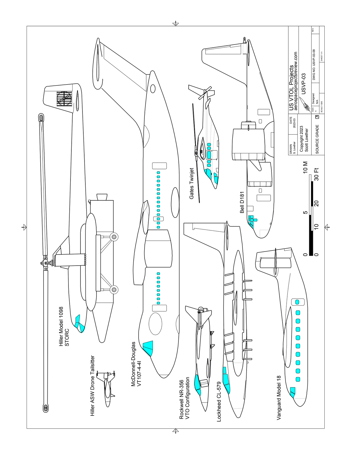
After a delay of several years, I'm back to working on my own little publications. Since the delay was caused by working on actual published *books,* I like to think that I've gotten a bit better. Thus the next issue of US VTOL projects has about twice the text of the prior issue, and the diagrams are a bit better. To get best use of the diagrams, I'm reviewing how they are being incorporated into the final text. The link below is a test PDF with four pages... each page has the same illsutration, but with variations in resolution, line weight, etc. I'm interested in what looks "best." so take a look and let me know which page - if any - looks best on screen, and if possible printed out.

You are using an out of date browser. It may not display this or other websites correctly.
You should upgrade or use an alternative browser.
You should upgrade or use an alternative browser.
What page looks best?
- Thread starter Orionblamblam
- Start date
martinbayer
ACCESS: Top Secret
- Joined
- 6 January 2009
- Messages
- 2,374
- Reaction score
- 2,103
I concur - the cleaner the picture, the better. I see no value whatsoever in double framing (or even single framing, for that matter), only wasted space and ink if printed. But also, I really can't tell any difference between pages two though four - what am I missing?
Last edited:
Same, don’t see much difference in versions 2-4 either, even when printed.I concur - the cleaner the picture, the better. I see no value whatsoever in double framing (or even single framing, for that matter), only wasted space and ink if printed. But also, I really can't tell any difference between pages two though four - what am I missing?
- Joined
- 6 November 2010
- Messages
- 4,228
- Reaction score
- 3,170
I zoomed in on the images, I am agnostic on framing. Little difference at low zoom. At high zoom, I liked #2 best.
When printed I definitely prefer #2, in my view the cleanest of the lot.
Laserjet printer, line weight the deciding factor for me.
When printed I definitely prefer #2, in my view the cleanest of the lot.
Laserjet printer, line weight the deciding factor for me.
- Joined
- 27 December 2005
- Messages
- 16,476
- Reaction score
- 19,211
I agree. I'd go one further and delete the info block too - we know Scott drew them and the date is fairly irrelevant. Just keep the scale and the aircraft.From a graphic designer point of view: why not go borderless?
Lets the planes define the border and that will open up a lot of space.
Just an idea.
zebedee
ACCESS: Secret
White space is one of those things that my design lecturer's used to bang on about but really can make a difference to a page, so count me me in for the borderless suggestion as well!From a graphic designer point of view: why not go borderless?
Lets the planes define the border and that will open up a lot of space.
Just an idea.
As for line weights I'm in the Number 2 camp!
Zen
- Joined
- 6 September 2006
- Messages
- 4,327
- Reaction score
- 7,515
I would say #2 possibly #4 but 2 looks best. Getting the line thickness right is tricky but important. I think my own GA drawings look a little thin sometimes but I'm not really fond of 'fat' outer lines that can look a bit cartoony in print. Might I suggest maybe altering the window shade to something a little greyer perhaps?
I agree with the other comments about the info box, just needs your name and the all important copyright 'C'.
I'm in two minds about a border, for a full page it might not be necessary but for a half-page or smaller nested box it would look ok.
I agree with the other comments about the info box, just needs your name and the all important copyright 'C'.
I'm in two minds about a border, for a full page it might not be necessary but for a half-page or smaller nested box it would look ok.
jeffb
ACCESS: Top Secret
- Joined
- 7 October 2012
- Messages
- 1,227
- Reaction score
- 1,722
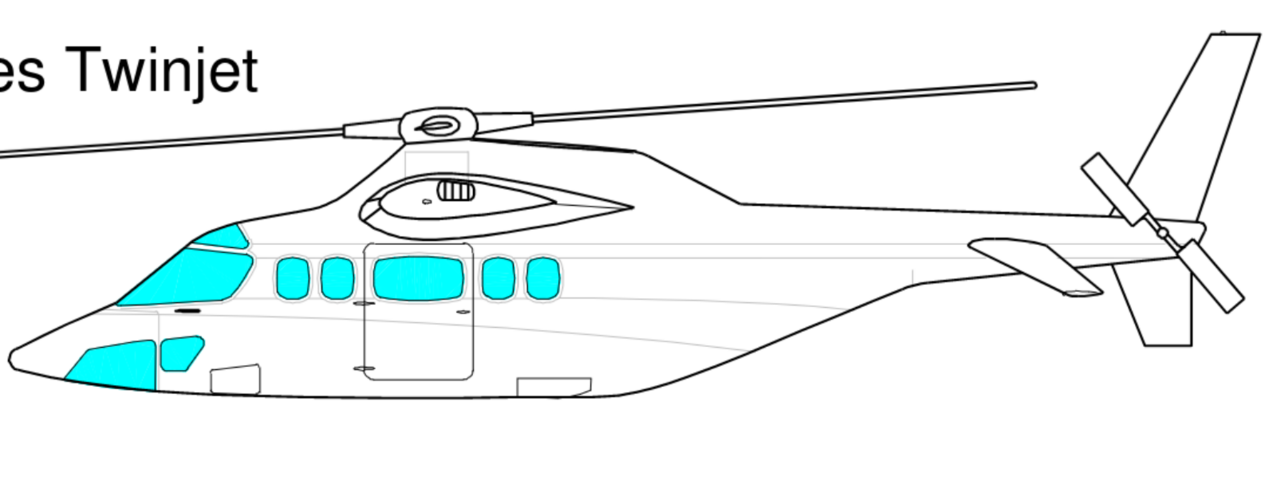
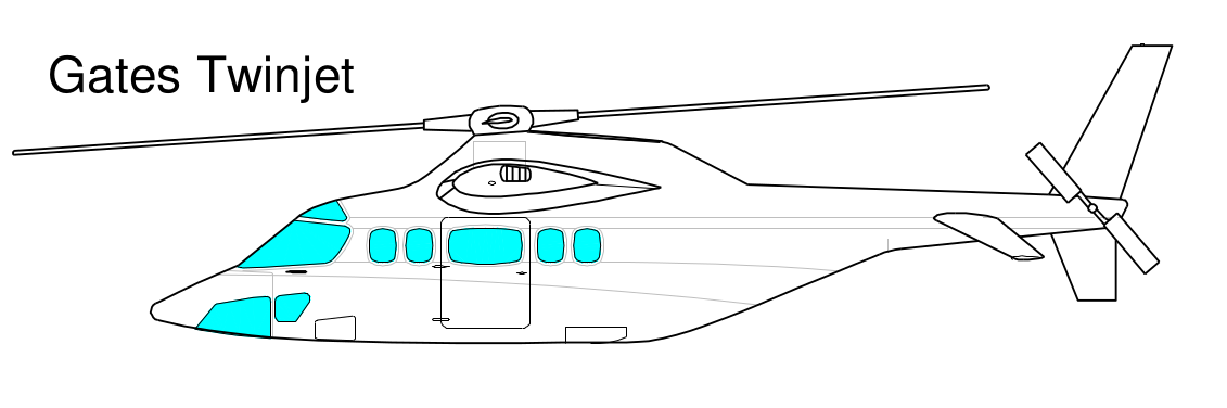
Just my two cents and I'm not sure what sort or size of page you were going to print them on, but looking at the PDFs the 'jaggies', those blocky step artifacts you get when you try to represent a curve with a series of rectangles were very noticeable. Less noticeable on the images with a thick outer border obviously, probably because the thicker border provides a level of default anti-aliasing. That can be a bit overwhelming though, like with the ASW tailsitter on the left where the detail can wind up being buried in those borders
So, maybe go for higher resolution images if that's possible and avoid the heavier borders, or use them selectively, leaving them off the smaller images and leaving them on the larger ones to smooth out the lines.
The other thing, which is probably just me, would be to put more light detail lines in the interiors beyond port and hatch outlines. These can really help flesh out the image and make it appear a bit more 3d.
jeffb
ACCESS: Top Secret
- Joined
- 7 October 2012
- Messages
- 1,227
- Reaction score
- 1,722
I zoomed to over 250% and they remained noticable to me. May depend on software.Jagged lines disappear on zooming in, printed images on A4 show no jagged lines at all.


Can you try to open it in another program or browser?Just my two cents and I'm not sure what sort or size of page you were going to print them on, but looking at the PDFs the 'jaggies', those blocky step artifacts you get when you try to represent a curve with a series of rectangles were very noticeable. Less noticeable on the images with a thick outer border obviously, probably because the thicker border provides a level of default anti-aliasing. That can be a bit overwhelming though, like with the ASW tailsitter on the left where the detail can wind up being buried in those borders
So, maybe go for higher resolution images if that's possible and avoid the heavier borders, or use them selectively, leaving them off the smaller images and leaving them on the larger ones to smooth out the lines.
The other thing, which is probably just me, would be to put more light detail lines in the interiors beyond port and hatch outlines. These can really help flesh out the image and make it appear a bit more 3d.
If I am correct it should be a PDF with vector linework in it.
Vectors are lines drawn with math, and can be zoomed in without ever displaying any pixels.
My Chrome and Firefox display it without any problems.
The problem with added a bit more detail is that there is none... Scott works from drawings that were more then napkin sketches, but less then production drawings: studies to find working dimensions get a sense of how it would look like. All kinds of details were added in much later ( or more often never. As the plane never reached hardware stage/production in that shape or was cancelled all together.)
I as a 3D artist has to invent stuff regularly to fill up those missing pieces, it is a job in itself to find time-period accurate holes and ports on a never made plane and to make the whole plane believable.
jeffb
ACCESS: Top Secret
- Joined
- 7 October 2012
- Messages
- 1,227
- Reaction score
- 1,722
Opened it up in Adobe Acrobat Reader and it's about the same result.
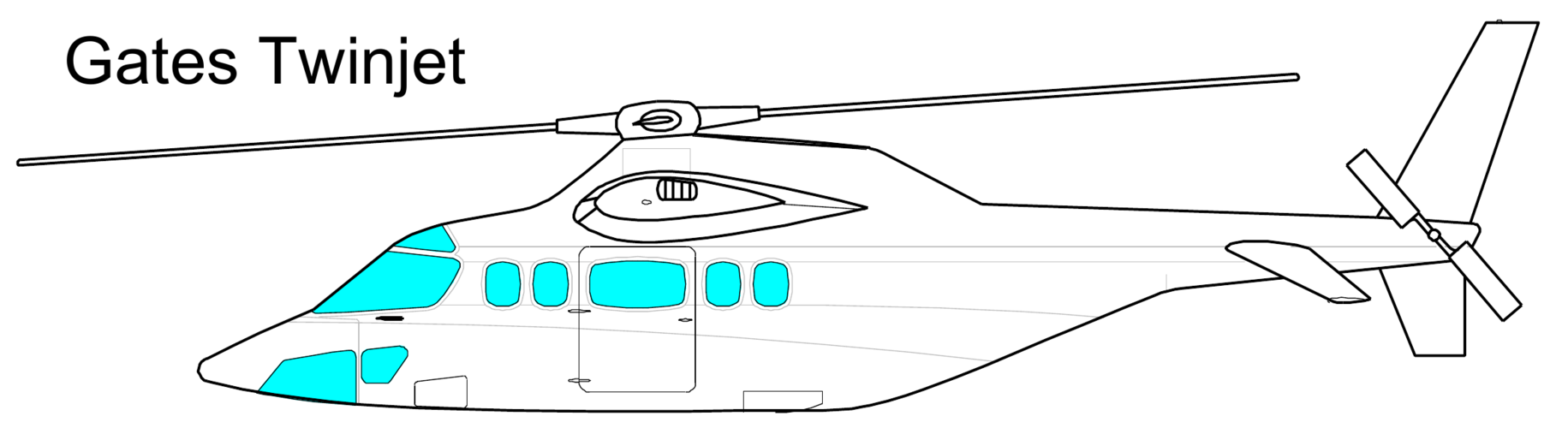
Things like the twinjet's rotors and the rear of its fuselage are really noticeable to me. The rear ramp of the Bell D101. When you start moving the image around it really stands out too, for me at least. I'm probably just being too picky though. If you look at the signature block though, all perfect curves, although I think they use a different trick for font libraries.

Things like the twinjet's rotors and the rear of its fuselage are really noticeable to me. The rear ramp of the Bell D101. When you start moving the image around it really stands out too, for me at least. I'm probably just being too picky though. If you look at the signature block though, all perfect curves, although I think they use a different trick for font libraries.

- Joined
- 6 November 2010
- Messages
- 4,228
- Reaction score
- 3,170
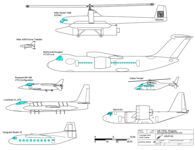
I have made some screen captures on opening test.pdf with Firefox at 650% zoom, Evince at 195% zoom (linux pdf-viewer, will not zoom further) and Okular at 800% zoom (another linux pdf-viewer, will zoom up to 10,000%)
Images in test.pdf appear to be vector images.
All images from page #2. Ubuntu 22.04.
At extreme magnification, Okular shows angles in lines that appear as curves at lower magnification - never jagged lines.
Images in test.pdf appear to be vector images.
All images from page #2. Ubuntu 22.04.
At extreme magnification, Okular shows angles in lines that appear as curves at lower magnification - never jagged lines.
Attachments
Last edited:
Silencer1
That now I am the Ruler of the Queen's Navee!
- Joined
- 3 August 2009
- Messages
- 888
- Reaction score
- 512
Thanks for sharing and asking for opinion!
Tested the file with 3 different PDF-viewers: Acrobat Pro, Google Chrome intrenal viewer and QuickLook (Mac). All them made effective smoothing and antialising of the line art. Even with the 400-500% zoom shortest lines (which actually represents curves, as chain of straigt segments) doesn't bother me. At b/w laser printing all pages looks nice, except for one small "imperfection" - thin grey inclined lines looks "torn apart" at the middle. Obviously, insufficent line width for the current printing resolution.
My personal favorite is page 1, with slightly thicker internal lines. I also think, that if the smaller elements of the drawings could be made with "intermediate" thickness, it would further improve image.
Perhaps, smaller side views (like Hiller ASW drone), and/or smaller details (missile under Rockwell VTOL) could be outlined with thinner lines - thus downgrading their visibilty (demanding less attention), providing better perception of the whole drawing.
Drawing border and table could be either omitted or represented simpler. I also suggest to made scale rules less visible.
P.S. Very nice to see, that works are in progress and you are looking for the best solutions
Similar threads
-
-
-
-
 Anyone have Air Pictorial 1964 issues? Looking for an article
- Started by overscan (PaulMM)
- Replies: 2
-
