McDonnell Douglas Model 279-1

The Artist

ACCESS: Top Secret
Senior Member
Joined
1 November 2009
Messages
638
Reaction score
384
This posting is both an exposure test and a request for critique.

The shapes are based on the model in the collection of the Greater St. Louis Air & Space Museum so they may differ slightly from other references. That background was my attempt at pulling off something like Shigeo koike's outrageous but fun backgrounds. This painting was done for the Greater St. Louis Air & Space Museum.

One thing I have noticed after seeing it reduced to a photo is that I have to add contrast to the missiles. So, anyone see anything else?
 

Attachments

  • McDonnell Douglas model 279-1 Critique Image 2.jpg
    McDonnell Douglas model 279-1 Critique Image 2.jpg
    264.6 KB · Views: 848
The port (left) canard seems to be mounted lower on the fuselage and/or smaller than the starboard one. The port canard also seems to have a more rounded tip than the starboard one.

And a nitpick: the fluffy clouds go suddenly from light pink in the top half to dark pink/purple/violet/what-the-hell-color-it-is in the lower half. A gradual transition would seem better, dunno.
 
Not nearly as picky as Orionblamblam, but clouds do seem a bit uniform and... solid.
 
Orionblamblam said:
The port (left) canard seems to be mounted lower on the fuselage and/or smaller than the starboard one. The port canard also seems to have a more rounded tip than the starboard one.

And a nitpick: the fluffy clouds go suddenly from light pink in the top half to dark pink/purple/violet/what-the-hell-color-it-is in the lower half. A gradual transition would seem better, dunno.

Thanks Scott. This is the kind of critique I wanted. I can see now what you're talking about with the placement of the port canard. I'll be at the museum later in the week and I'll have to compare the painting to the model to see which one I will have to adjust. (Most likely, it is the left one.) I believe the apparent difference in the canard tips is due to the starboard outer edge being defined by the lower surface while from this viewpoint the port outer edge is being defined by the greater curve of the upper surface. I will check this against the model but I remember the canards on it being thick enough to create this illusion.

The "what-the-hell-color-it-is" is the reason this was posted as an exposure test. That lower portion of the cloudscape is looking brownish in the photo while on the painting it is a low-key red violet. I'm also having a problem getting the lightest portion of the sky looking as white in the photo as it is on the painting.
 
yasotay said:
Not nearly as picky as Orionblamblam, but clouds do seem a bit uniform and... solid.

I agree with your comment but I'm glad I tried it this way. I learned some things that should be useful with paintings I intend to do.
 
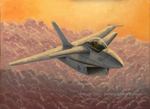
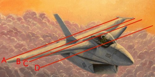
As a side note, the wingtip missiles look off as well, in terms of the wing twist at the tip. The missile in the left of the art looks angled down while that on the right looks angled up.

As a side note, have you ever looked at some of the sketches by Keith Ferris or other aviation artists, where they layout the aircraft as a drawing with many cross sections drawn in perspective and then paint over it? It's as if they "draft" the structure of the aircraft, add in the details, then paint it.

Below is a link to his main page and a link to the second page of his studio link and you can sort of see how he lays out his paintings.

http://www.keithferrisart.com/Default.asp

http://keithferrisart.com/thestudio2.htm

You may already know most of this, but I'm just trying to offer some help as you're putting a lot of work into it and I think you're making good progress. Sometimes when I sketch aircraft and I can't quite get the basics laid out correctly, I use 3D CAD to get the basic cross sections in place then rotate it, as opposed to drawing it, to get the proper perspective I want for reference. You can even do that with paper or cardboard. Draw some cross sections on cardboard and space them out properly on a pencil, straw, or whatever is available to you and cut out the wings and tails and tape them on and rotate it to get a feel for how they look in relation to each other. I'm just trying to offer some suggestions that might help you out, in much the same way artists and animators use those pose-able wooden figures to get human anatomy right. Keep going!!

Edit: Something else I hadn't really thought of until now is, if you are using cardboard, you can draw the top view and side view and cut them out and cut one halfway down from the tail and the other halfway down from the nose and slide them together. Throw on some cross sections and the tail placement and you would have a good quick model for reference, sort of like those simple balsa planes I used to buy when I was kid (With the exception of the cross sections ;) )

Oh, and as long as you're a glutton for punishment, when I'm sketching a design I'm making, I like to show sort of a perspective top view like you've done, then have the wingman peeling off so you can also see a perspective bottom view. It helps "flesh" out the design IMHO.
 
In some way I like it, but I would try to do another version applying those suggested changes.

I know that, sometimes, even the perspective being correct, it causes a distorted perception by our eyes. In this case, I think it is better to "scape" a little bit from the correct form and give the image an impression of more visually harmonic work.

Concerning to the clouds, something that I would try is to apply an orange tone to the far clouds close to the horizon and turn into violet, as you did, the way you come closer to the first clouds.

Naturally it is just a tip :)
 
The Artist said:
I believe the apparent difference in the canard tips is due to the starboard outer edge being defined by the lower surface while from this viewpoint the port outer edge is being defined by the greater curve of the upper surface.

The image below has four parallel lines:
A: Wingtip-to-wingtip, choses ans the "horizontal baseline"
B: Should be canard-aft-tip to canard-aft-tip, but the port wingtip is somewhat below the baseline
C: Should be canard-aft-root to canard-aft-root, but even though the port root isn't visible, it's clearly *well* below the starboard root. Coincidentally also serves as canard-forward-tip to canard-forward-tip, and *almost* matches up
D: Should be canard-forward-root to canard-forward-root, but again the port root is well below the starboard root.

An easy way to make a truly symmetrical, quick model (out of cardboard, say): make either the left or right half of it... then stick it to a mirror.

EDIT: Is suppose it would help if I actually attached the image...
 

Attachments

  • lines.jpg
    lines.jpg
    81.2 KB · Views: 540
Scott,
After looking closely at the model on Wednesday, I have to say I'm surprised that you found fault with only that left canard. I had used the model and my reference photos of it to develop the painting, but I hadn't looked at it as one might to develop a three-view from it. It turns out that the wings, canards and vertical tail are all out of alignment.

I have been looking at the painting and I think I can see what to change on that canard. And yes, it turns out that I did have the curve at the tip exaggerated. My memory had it being thicker than it really was.
 
I found it all looked slightly out of alignment, the canards being worst, but didn't want to say anything. Its not my painting.
 
PaulMM (Overscan) said:
I found it all looked slightly out of alignment, the canards being worst, but didn't want to say anything. Its not my painting.

I understand your reason for not commenting, but I'm just saying that when I do ask for a critique, I want the thing to be shot down and ripped apart. I want people to tell me and show me what I'm not seeing because I've been too close to it. This is part of the learning process for artists.
 
The Artist said:
I want people to tell me and show me what I'm not seeing because I've been too close to it.

There don't appear to be any barbarian warrior babes in revealing yet ineffective chain mail armor. If your really want to make it big in art, you need the chicks in chain mail. Maybe riding a dragon or something.

Yeah. That's classy.
 
Orionblamblam said:
The Artist said:
I want people to tell me and show me what I'm not seeing because I've been too close to it.

There don't appear to be any barbarian warrior babes in revealing yet ineffective chain mail armor. If your really want to make it big in art, you need the chicks in chain mail. Maybe riding a dragon or something.

Yeah. That's classy.
BLAM!!! Yeah, I know... but damned if the song doesn't make you want to eat a steak and punch someone in the face.

http://www.youtube.com/watch?v=_2_gOpU0eWU

Here's the South Park spoof: http://www.southparkstudios.com/full-episodes/s12e03-major-boobage
 
Ah, that movie... Wonderful teenage memories. This and Conan the Barbarian...
 
The difference, though: "Conan" actually still stands up. Heavy Metal... ugh. The South Park guys signed up to make an HM-based episode based on their decades-old memory of the movie, then actually *watched* the movie, and realized that it's really quite awful.

Juuuuuuuuuust a bit off topic.

But yeah, if'n you can incorporate some Frank Frazetta into the painting, that'd really be something. Sort of a "Tyranosaurs in F-14s" level of pure Epic and Win. Hell, I know: instead of the Model 279-1 just flying around, have it taking on Cthulhu. That's something I've *never* seen... good art of real project-aircraft going up against giant monsters. Project Pluto diving onto Godzilla, that sort of thing...

Make it distinctive!
 
Orionblamblam said:
The difference, though: "Conan" actually still stands up. Heavy Metal... ugh. The South Park guys signed up to make an HM-based episode based on their decades-old memory of the movie, then actually *watched* the movie, and realized that it's really quite awful.

Juuuuuuuuuust a bit off topic.

But yeah, if'n you can incorporate some Frank Frazetta into the painting, that'd really be something. Sort of a "Tyranosaurs in F-14s" level of pure Epic and Win. Hell, I know: instead of the Model 279-1 just flying around, have it taking on Cthulhu. That's something I've *never* seen... good art of real project-aircraft going up against giant monsters. Project Pluto diving onto Godzilla, that sort of thing...

Make it distinctive!

Been away from this site for a few days and I see some good suggestions have appeared. I guess Frazetta on velvet should be great art.

Odd that you'd suggest giant monsters - I've been toying with an idea that is approaching that theme. I've been playing around with a pair of F/A-18s escorting either the Jet VTOL or the Sub VTOL (from Ultraman) away from the fleet. Giant monsters have a way of showing up in Science Patrol's wake and the U.S. Navy does not want any part of it.
 

Attachments

  • Sciencepatrol.jpg
    Sciencepatrol.jpg
    92.3 KB · Views: 355
Well, the movie Pacific Rim comes out this summer. :) Not airplanes, but I do like giant piloted robots too.
 

Similar threads

Back
Top Bottom