Drawings - Line width, level of detail and so on

CJGibson

ACCESS: Top Secret
Senior Member
Joined
26 May 2011
Messages
2,111
Reaction score
2,692
"All of Jen's drawings, while excellent, tend towards the lines being too thin. When printed at high resolution, they are too fine."

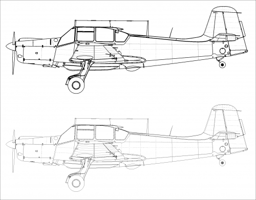
Very interesting, maybe time to compare notes on line weights. I draw the masters at A3 with 1pt weight for outline, 0.5pt weight for panels, control surfaces and detail. I use Illustrator (badly).

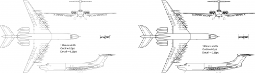
For reproduction I took Russ Strong's advice and reduce the drawing width to 190mm (just under A4 width) and change the outlines to 0.5pt and detail etc to 0.25pt.

These seem to show up OK in Crecy's pages and in Project Tech Profiles, or at least nobody has squealed (yet). My earlier stuff in BSP4 was all done at 1pt as I didn't know any better.

Scott's drawings always show up nice and clear, so I wonder what weight of line he uses.

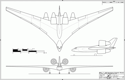
Of course everyone has their own style for doing GAs. Personally I've never been a fan of the split dorsal/ventral view.

Chris
 
I didn't know the printed size of the drawings before and I think, often the authors didn't even know the final
layout before, too, so it would be the responsibility of the publisher. Scott probably has the advantage of a
"one-stop shop" here. But I hope, I have learned my lesson and will be more nerving with regards to this
point in the future !
By all means, Deino has written a great book, which is more, than a compilation of aircraft types, but very good
reading indeed !
 
Possibly because the authors aren't doing the drawings.

I now do all my final drawings to Russ' recommended 190mm width and it seems to work.

See attached. Both are 190mm wide, fits perfectly across a A4-ish page with no loss of resolution.The drawing on the left is done as per Russ' spec, the one on the right was reduced from an A3 drawing.

Might not show up very well on the PNG file.

Comments?

Chris
 

Attachments

  • A4_Compare.png
    A4_Compare.png
    158.6 KB · Views: 407
The drawing on the left looks sharp, the one on the right looks slightly crude in comparison.
 
On the right side, the lines look somewhat clearer, but obviously details are lost, like the double lines of
the cockpit framing. There probably isn't an universal solution, it's a matter of the detail level to show.
Have just experimented with Chris settings, the upper drawing uses .5 pt (black) for outlines and .25 pt
(grey) for panel lines/riveting, the lower drawing .05 pt for both and here too more details get lost with
thicker lines.
Of course, panel lines and rivets on a drawing of a project are in most cases dispensable !
 

Attachments

  • comp.png
    comp.png
    98.4 KB · Views: 346
Morning chaps,

Aye, level of detail. I've been drawing airships lately. You can spend ages doing detail on the cabins and power cars, but at the end of the day all the detail is lost on the printed page due to scaling. Is it worth putting in so much detail if it is lost on reproduction?

Chris
 
Regarding the over-fine lines in the finished book, I'm wondering if the printers have over-compensated for 'dot gain', which would thin the lines in the drawings too much?
http://www.prepressure.com/design/basics/dot-gain

cheers,
Robin.
 
CJGibson said:
...Is it worth putting in so much detail if it is lost on reproduction?

Good question, I'm curious about the result, too! I've made it according to the authors wishes,
but still yet actually Idon't know the format, it will be printed. Maybe a new argument for electronic
publications !
 
Maybe a new argument for electronic publications !

Indeed, but you'd end up with a digicam-style resolution war and where do you stop? 1000X zoom in? My tests show that drawings actually reproduce rather well on the Kindle Paperwhite, as well as tablets. However, zooming on a kindle is problematic, which therefore limits the resolution required.

We've already determined in another thread that the manufacturers' drawings are pretty ropey, so do we merely compound innacuracy with increased resolution and at what level of resolution do you stop? Window framing? Rivets? I now produce two versions of my drawings, the 190mm width for books or Kindle and the A3 size master for working from, available on request.

Maybe time to move this discussion to that other thread?

Chris
 
CJGibson said:
Maybe time to move this discussion to that other thread?
Of course you're right!

CJGibson said:
Indeed, but you'd end up with a digicam-style resolution war and where do you stop?

It's a question, that principally only comes up for actually built aircraft, as only here you can try
to add details from the "real thing". And here the 1/48 scale is often used, easily going beyond the
constraints of the 190 mm width (which principally seems to be a good size for me, too).
For projects, it's not a question, of course, as long as you aren't working on just an unbuilt variant
of a real type. And still then, rivets and panel lines are more "what-if", than real detail.
So, as often, it depends on personal style and preferences. And on communication between
draughtsman, author, publisher and probably printer.
 
I tried to engage my publisher, Fonthill, in just such a discussion as the line width obviously has to be tailored to the size of the printed drawing, but they did not want to do so. How dumb can you get.
 
For what it's worth:

I'm constantly tinkering with line settings, but I've largely settled on the results shown below. I do my drawings in AutoCAD 2000 and then further processing in Paint Shop Pro. The lines in ACAD are split into several layers:
1) "Outline:" This is for, obviously, the main outlines. This includes major overlaps, such as engine nacelles in front of wings of fuselages and such. Also used for sharp intersections, such as some wing/body intersections, when the angle of intersection is greater than 45 degrees. "Outline" is White (which prints black) with a lineweight of 0.40 mm.
2) "Details:" used for things like control surfaces, doors, windows, etc. Also used for intersections at less than 45 degrees. Also White, with a "default" lineweight.
3) "Lines:" Used for panels lines, faint intersections and the like. uses Color 253 (medium gray) and a default lineweight.

The process for going from ACAD 2000 to a good raster image is more complex than it would seem to need to be; I imagine more recent versions of ACAD have cleaned the process up. Anyway:
1) Plot the drawing as an EPS file at ANSI C size (22X17 inches)
2) Open the drawing in Paint Shop Pro at 200 dpi, grayscale, no transparency.
3) Crop the image just at the outer border

The image just as-is is then saved as a GIF or PNG (not JPG, as that entails loss). It can then be plastered directly into a Word document. The drawing will print out (on paper) at a chosen scale if the border was drawn at a specific size, and when put into Word the image is formatted to be that width. If you want to print at a specific scale but don't wnat the border, you can still go through the whole process with a border, and then simply erase it /paint it out at the last step so that the image has the right size but no border.

I've found plotting the CAD drawing at larger sizes initially helps smooth out curves. But this means that the image is way too big for basic online posting, and the line weights get really thin and faint when the image is just resized smaller. So before resizing smaller one or both of the following:
1) "Erode" the image. This expands line widths. At full rez it looks pretty crappy, but when resized it works well.
2) "Blur" the image. This widens the lines and helps smooth it out, but makes everything lighter. The image can be darkened via gamma correction or brightness/contrast.

Something else to consider: "Drawing Order." With multiple line colors, it matters what lines are "over" and "under" what other lines. After the drawing is done in ACAD, the "draworder" commend lets you pick what lines are in front, what are in back. It's best to have the "Outline" layer in front, and the "Lines" layer in back. This way, when a black Outline line intersects with a gray "Lines" line, the black line is unbroken. Sometimes I forget this step, and the results can look *wrong.*
 

Attachments

  • v1n3-106-full rez.gif
    v1n3-106-full rez.gif
    189.8 KB · Views: 254
  • v1n3-106-ensmallered.gif
    v1n3-106-ensmallered.gif
    30.1 KB · Views: 231
  • v1n3-106-eroded-ensmallered.gif
    v1n3-106-eroded-ensmallered.gif
    35.4 KB · Views: 223
  • v1n3-106-blurred-ensmallered.gif
    v1n3-106-blurred-ensmallered.gif
    37.6 KB · Views: 55
That was actually very interesting and informative. Any of this kind of technical how-to is certainly appreciated.

Orionblamblam said:
The process for going from ACAD 2000 to a good raster image is more complex than it would seem to need to be; I imagine more recent versions of ACAD have cleaned the process up. Anyway:
1) Plot the drawing as an EPS file at ANSI C size (22X17 inches)
2) Open the drawing in Paint Shop Pro at 200 dpi, grayscale, no transparency.
3) Crop the image just at the outer border

That doesn't seem too different conceptually from what I have to do with satellite imagery. I get raw imagery as a 12-bit GeoTIFF file (which can be someplace around 600 MB to 2 GB in size), and have to crop out and reformat things to get the bits we want published. Anything that is to be published in print has to be scaled to around 23-25 inches at 300 dpi, or it can look pretty bad on the page. What I have to do is take the GeoTIFF, export it as a lossless JPEG, crop it down to size, and then set the scale and dpi to make sure everything will work out fine.
 

Similar threads

Back
Top Bottom